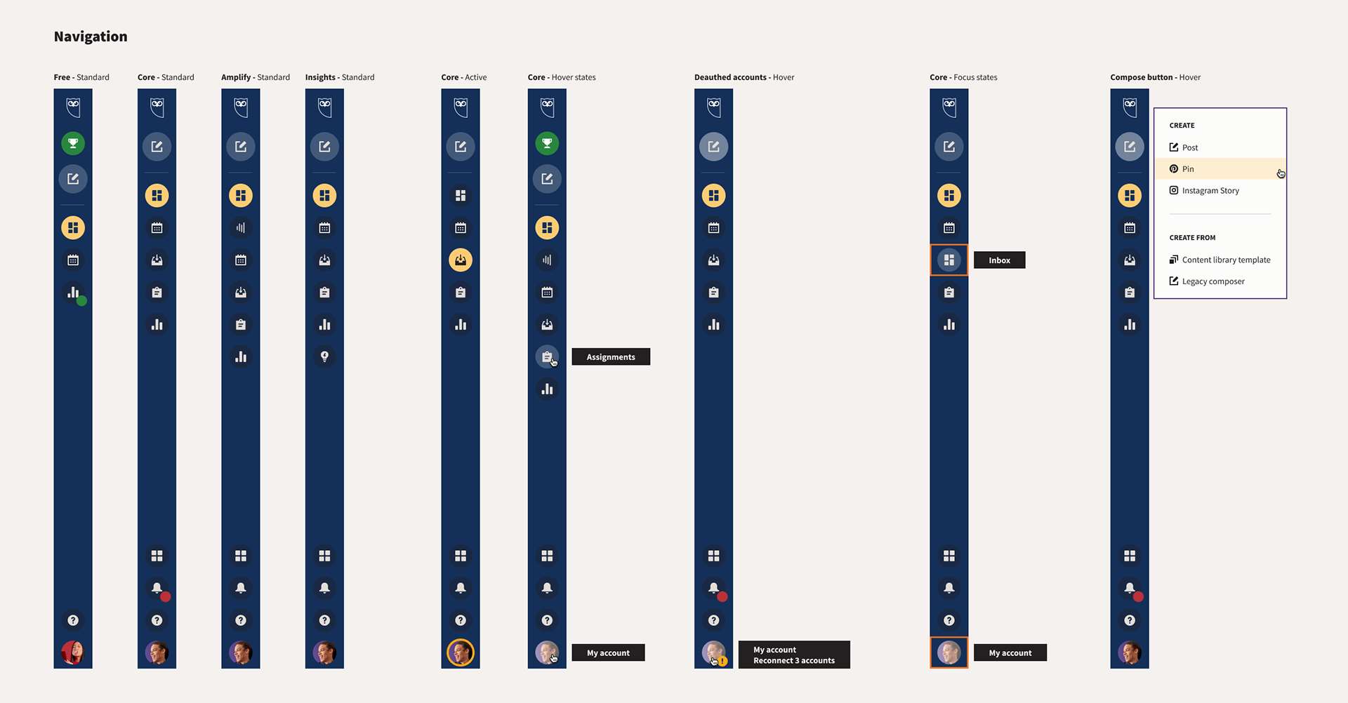
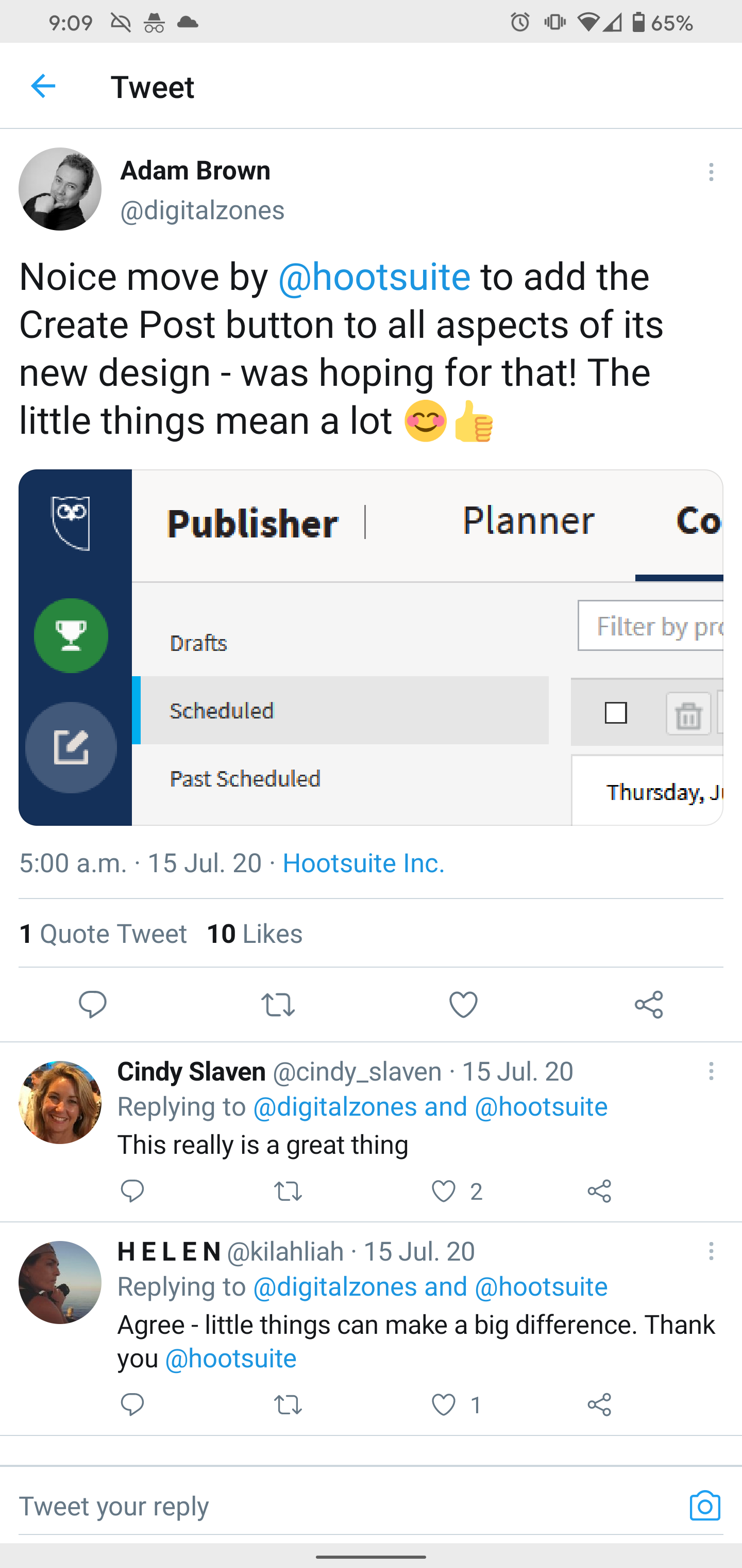
Hootsuite's new global navigation
A cross organizational initiative that redefined one of Hootsuite's most important navigational patterns.
Role
Lead senior designer
Lead senior designer
Collaborating with
Design: Product design, user research, motion design
Product: PM, engineering, product marketing
Marketing: brand
Design: Product design, user research, motion design
Product: PM, engineering, product marketing
Marketing: brand
When
June 2019 to August 2020
June 2019 to August 2020
Hootsuite's old main navigational system had grown increasingly complex over the years.
It needed a rethink to help make Hootsuite the most delightful and easy to use solution on the market.
We took advantage of an upcoming brand refresh resulting in a unified experience, a single front end component, and increased engagement and improved NPS scores.
How might we...
help our users find what they need when they need it?
help our users find what they need when they need it?
Strategic goals that we are pursuing
✔ Deliver a modern, cohesive and seamless end-to-end user experience
✔ Elevate our UI/UX standards and practices
✔ Improve and enhance existing product build
Some data to keep in mind
Any changes that we make need to accommodate existing users, their workflows and their needs. Changes need to be sober, enhance continuity, but also promote discovery.
577,993
Weekly active users, who send...
Weekly scheduled messages, of which...
1,717,094
messages are sent live
Process. Understanding the problem.
User goals considerations:
➜ Changes need to be sober, enhance continuity and promote exploration
➜ Accommodate existing workflows and needs, don't be an obstacle
➜ Improve our user's critical workflows whenever possible
Business goals considerations:
➜ Don't hinder A-ha moment, trial engagement, or other critical metrics
➜ Help reduce support and PSAT ticket volumes, improve UX/UI health scorecard
➜ Create an outstanding experience that sales teams can use for success
In addition, we knew from previous research that:
➜ Current navigation is not scalable
➜ It lacks focus, it is bloated and confusing for users
➜ It's overwhelming for first time users
➜ Users don't understand what most options in the nav are
➜ Users don't use more than 1 or 2 options because they don't need more
➜ Users use the 'compose' function in 98% of login sessions
➜ Top theme from previous research:
"Create a "core" single product experience that satisfies the majority of users who don't have complex workflows but do both monitoring and content creation"
"Create a "core" single product experience that satisfies the majority of users who don't have complex workflows but do both monitoring and content creation"
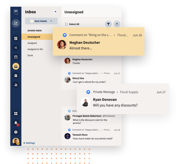
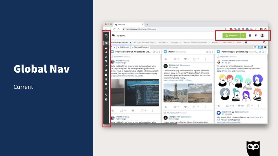
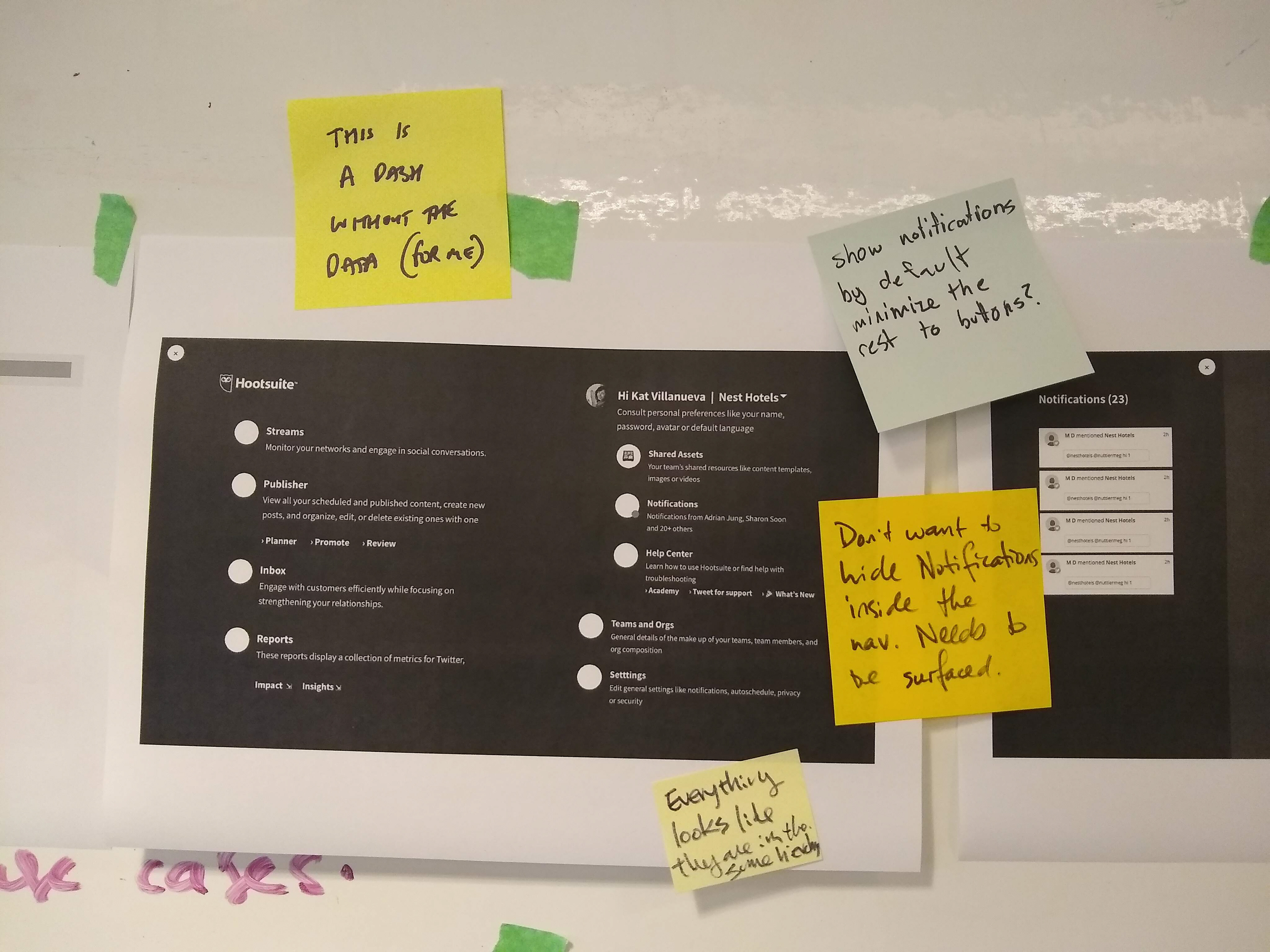
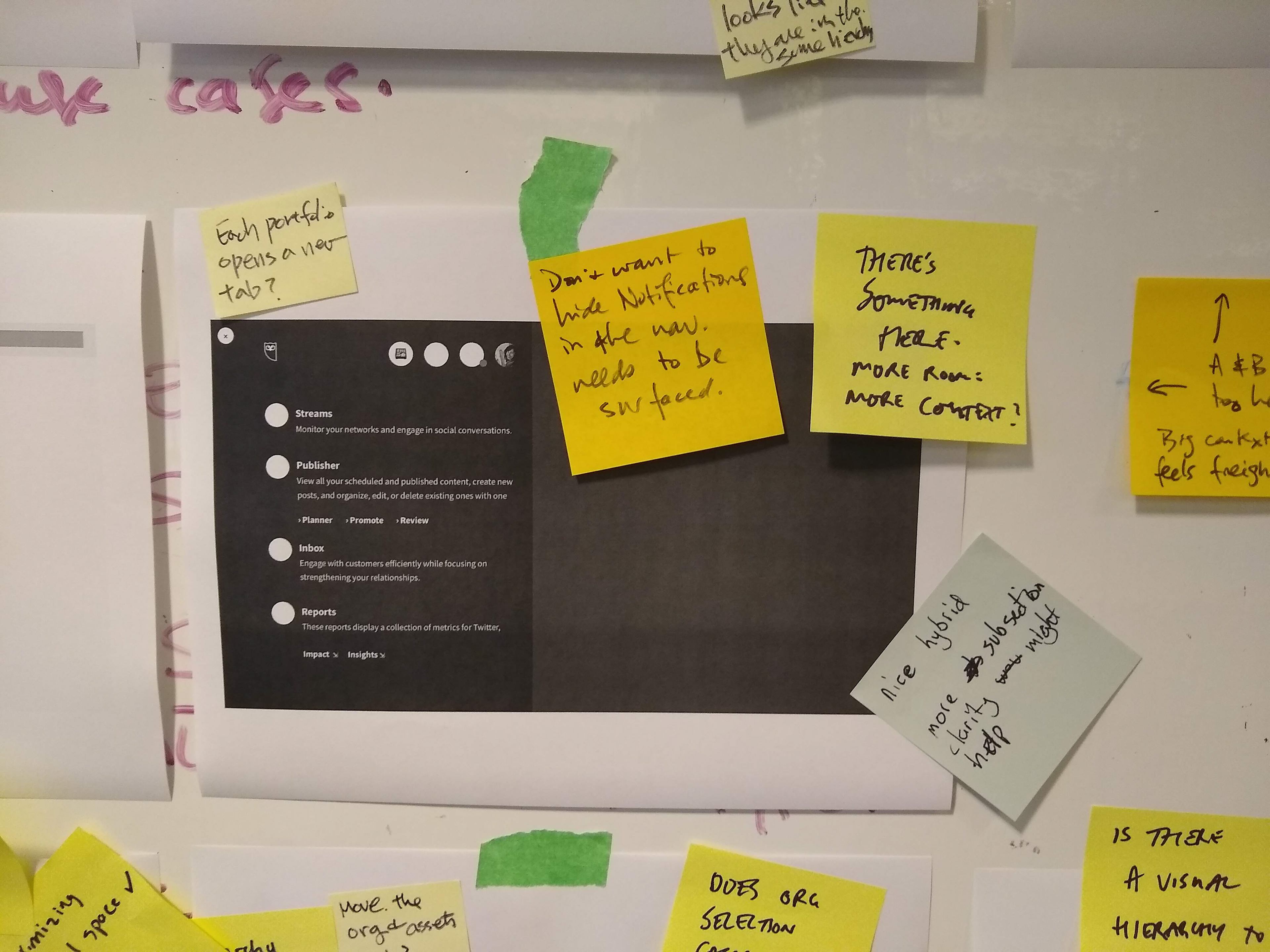
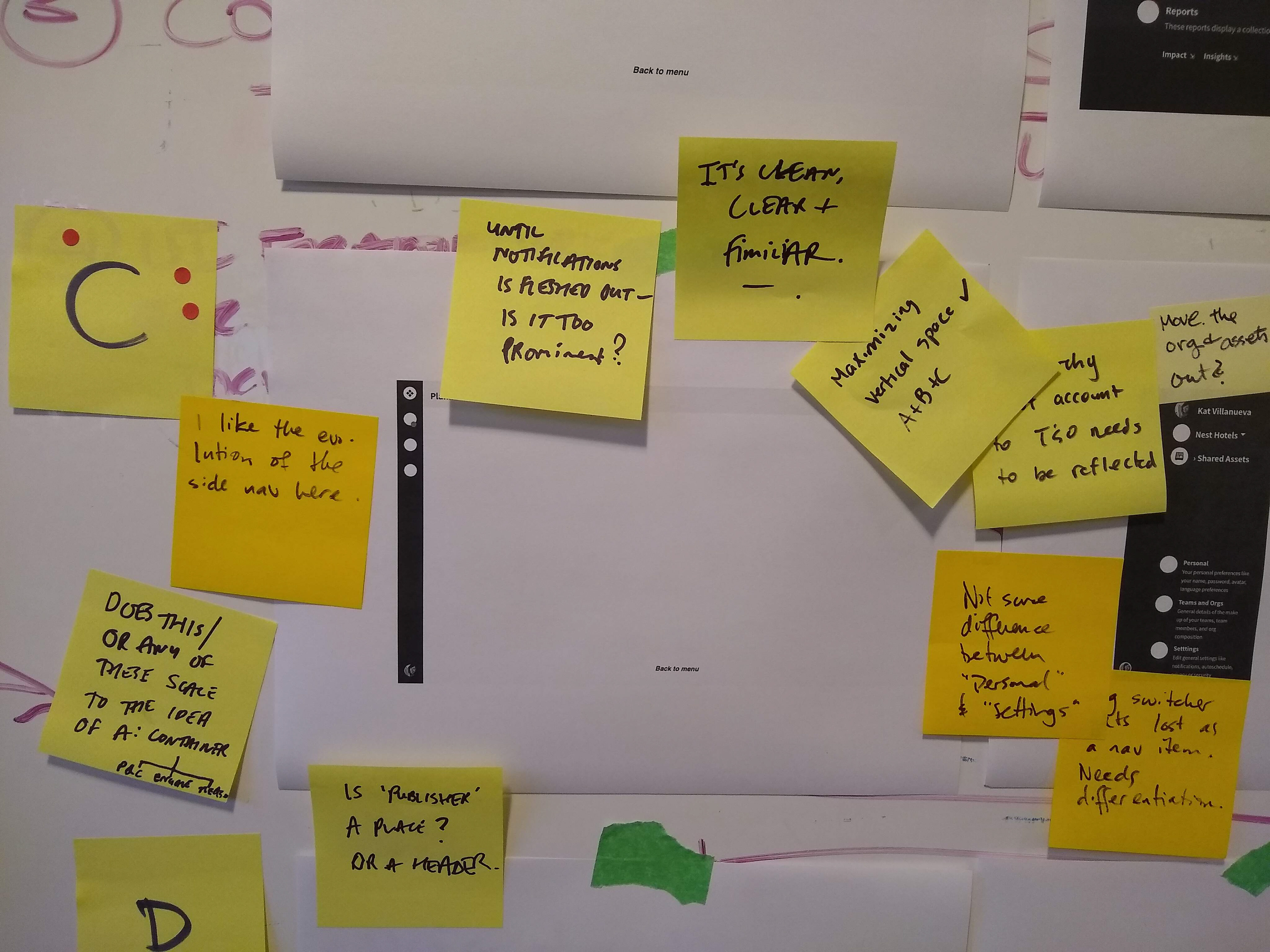
Hootsuite dashboard view, 2019.
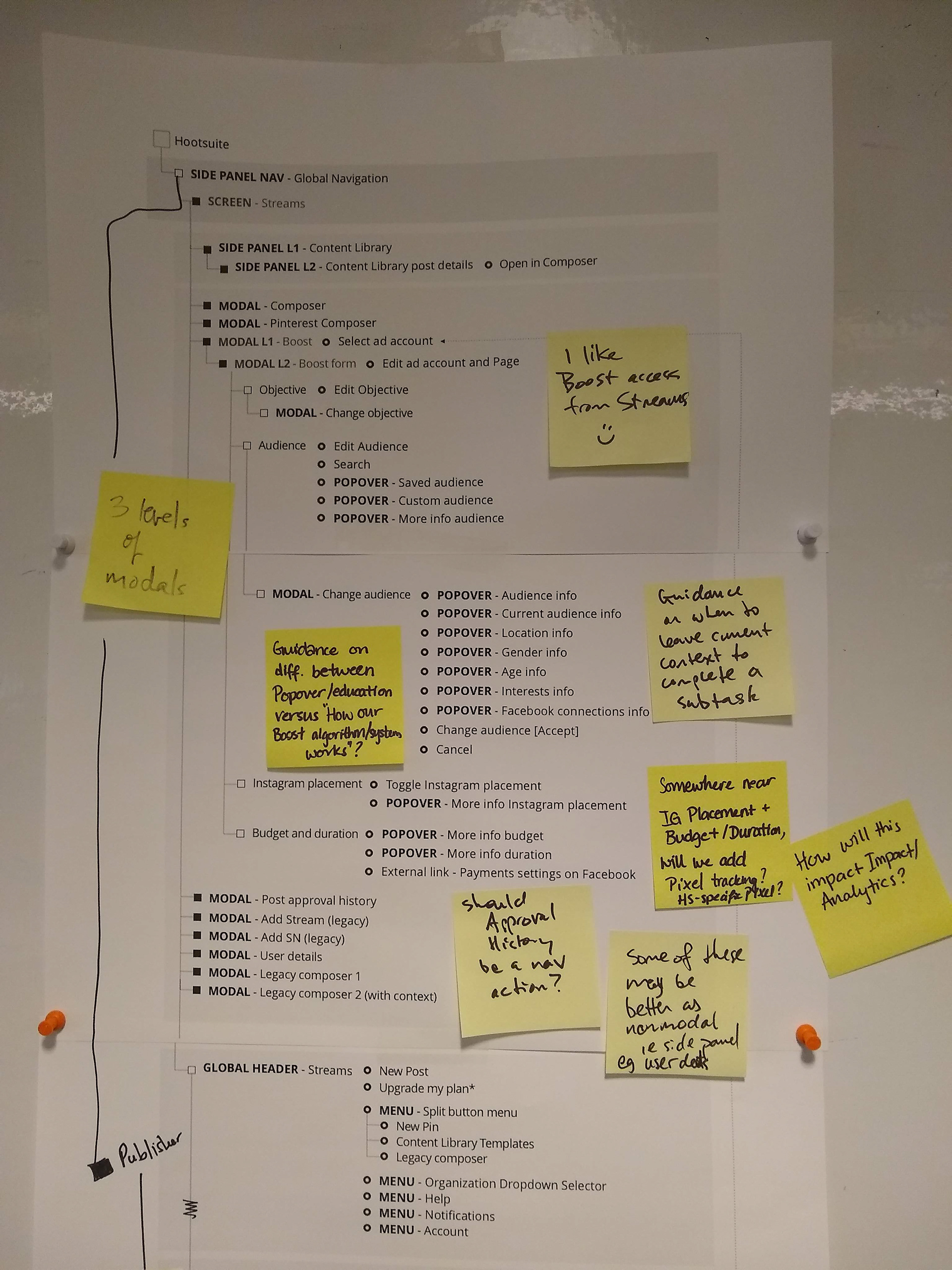
To improve the navigation, I needed to know what the internal structure looked like.
Hootsuite's structure was messy. It had grew so complex, even veteran design team members would have difficulty understanding where each of the pieces were located. In order to create a navigation that made sense, I needed to understand how exactly this internal structure looked.
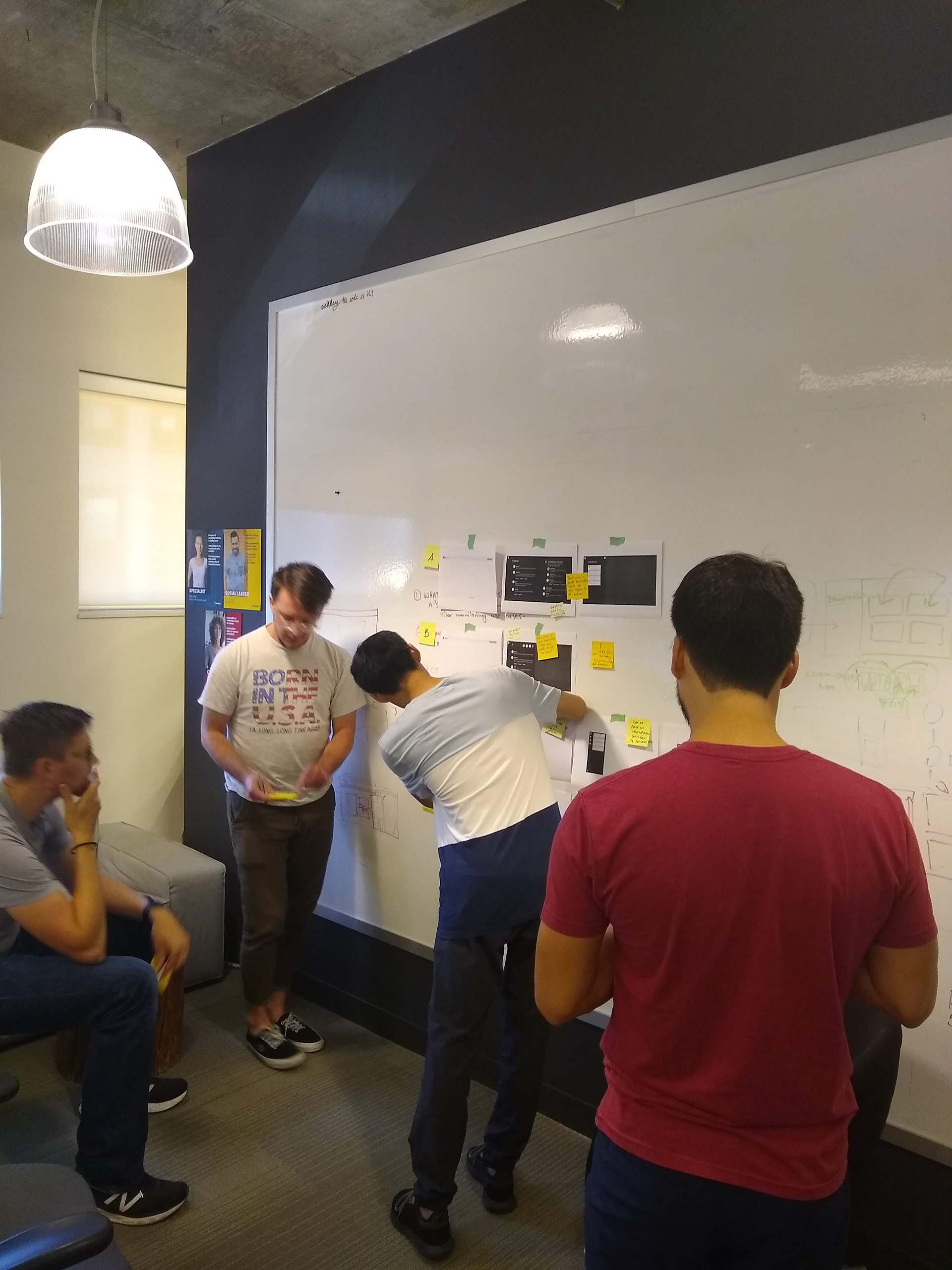
I couldn't do that alone, I needed help from my peers. So I ran a series of workshops that helped me clarify the structure.
The goal. To understand in very fine detail the underlying information architecture of the app.
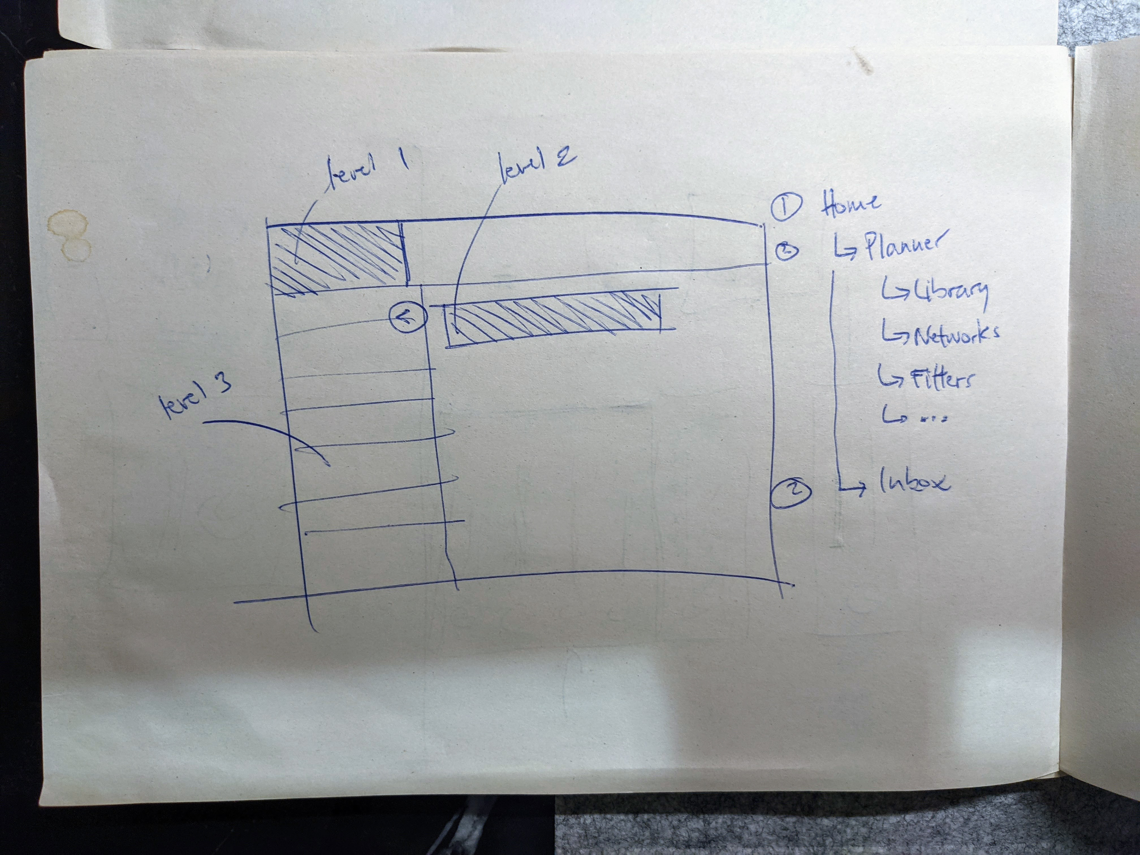
The output. An app map that ended up being complex but 80% logical. It identified solid structures, but also redundancies and areas of opportunity.
How can we help our users complete their day to day tasks more efficiently, and in some cases with improvements, with a new nav design?
In parallel, I needed to understand better our users' workflows and top tasks in-depth. The User Research team was very familiar with them, so we ran a series of workshops that included the entire product design team.
The goal. To design and iterate on a proposal that solves creatively one of the top tasks defined in our user journeys in order to generate ideas and inspiration.
The output. The exercise helped me clarify what the main critical tasks were, where gaps existed, areas for improvement, and also surfaced new ideas from design team members.
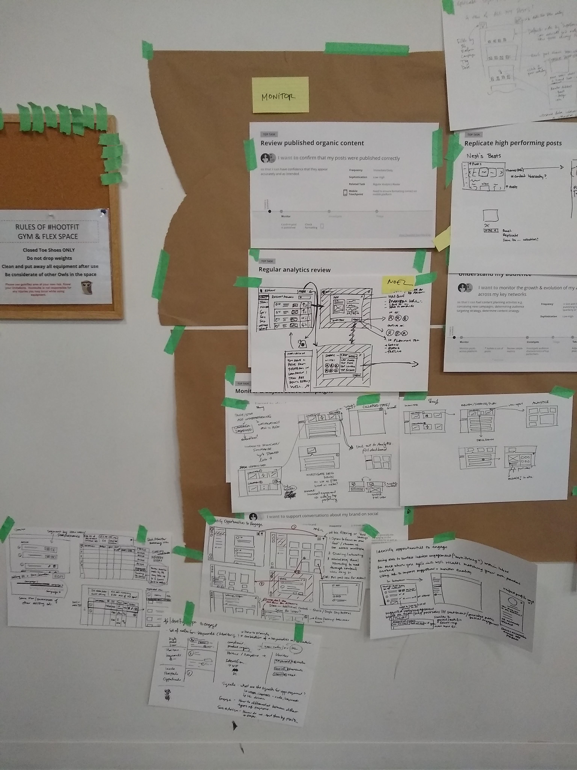
New ideas from team members on the wall
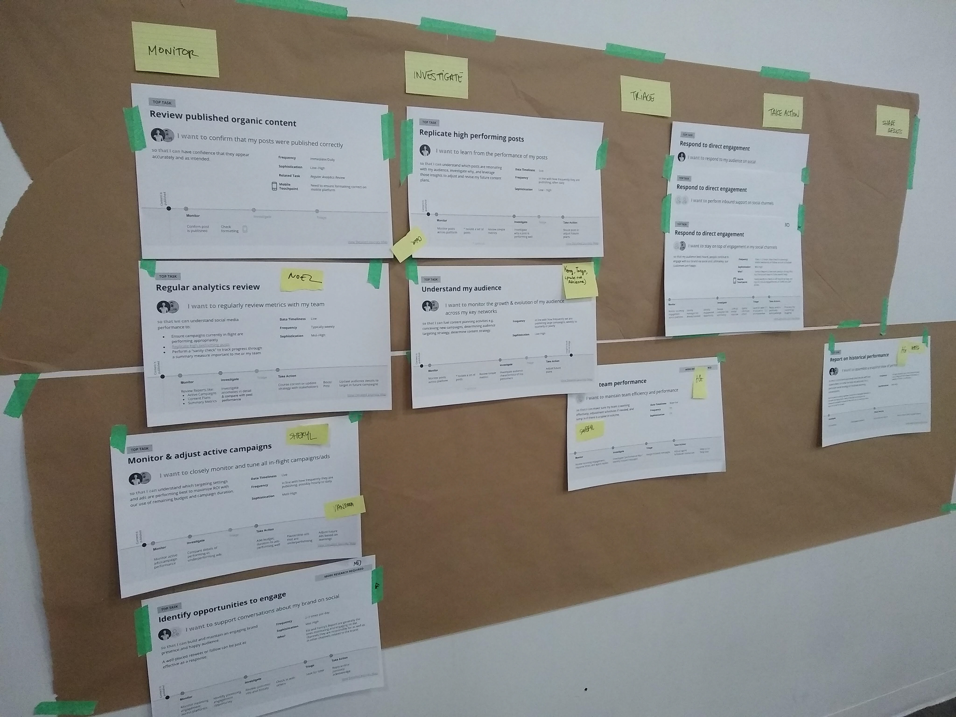
Top tasks on the wall
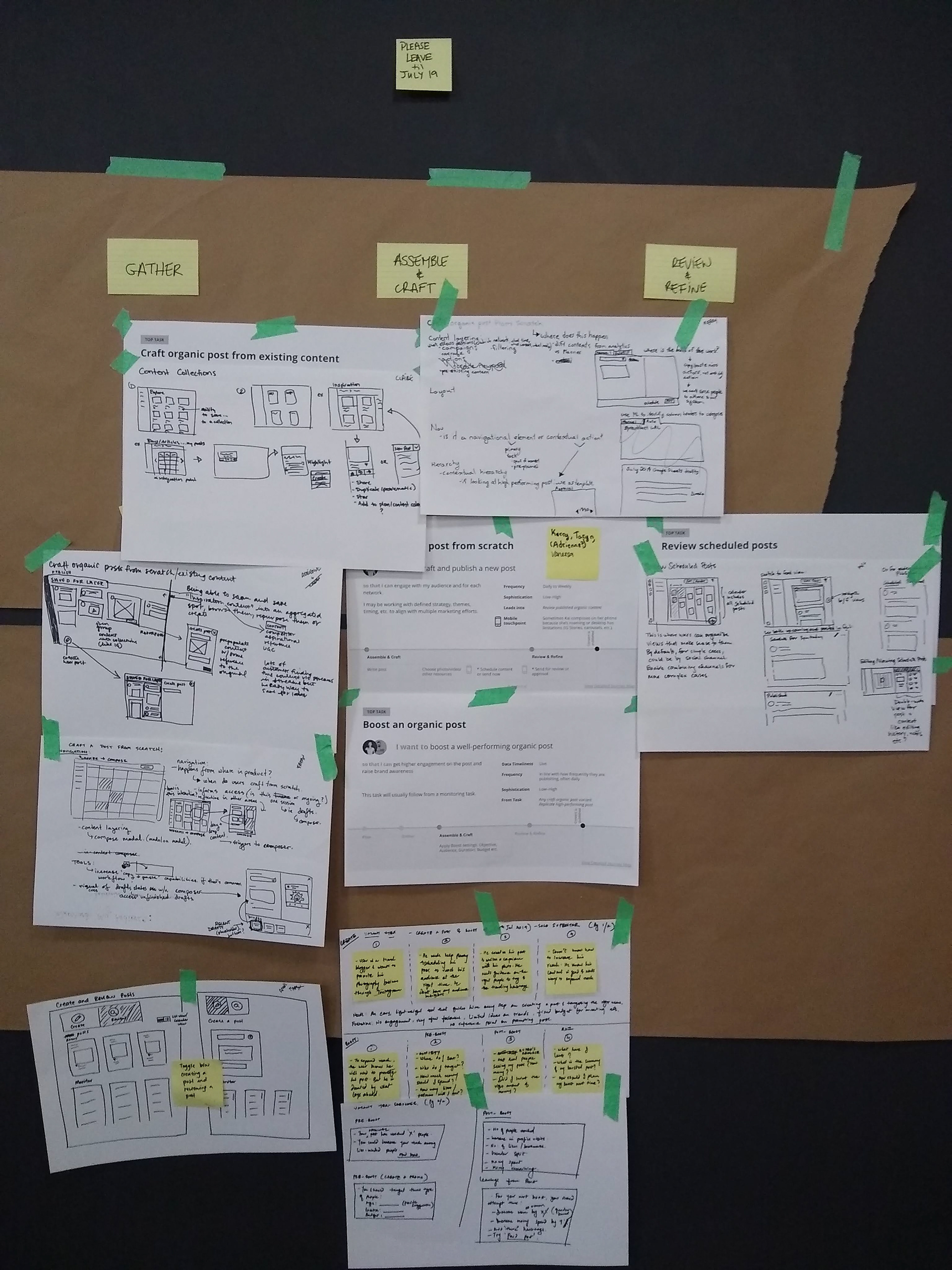
New ideas from team members on the wall
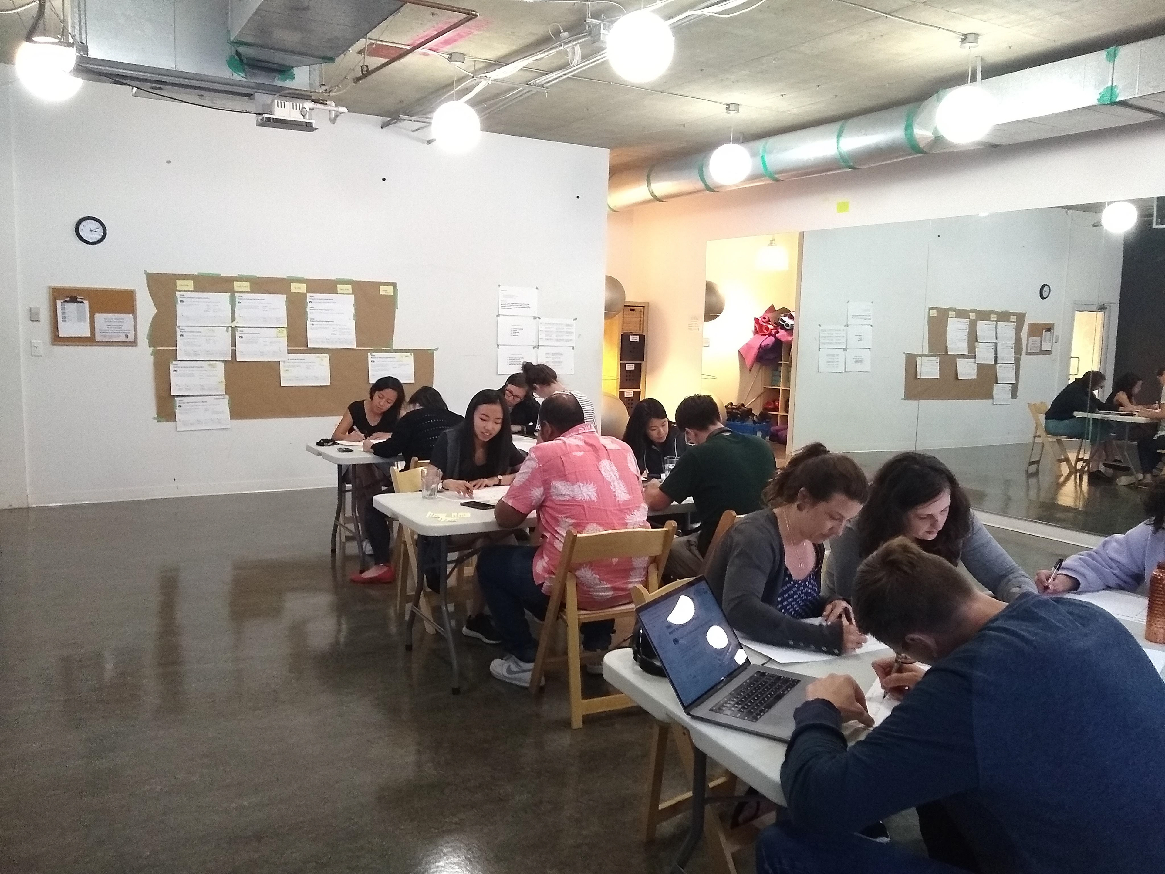
Product design team participating in workshop
Concept ideating, sketching and iterating
Based on the findings from the workshops above, I teamed up with our senior design director and other senior designers to work and sketch out a series of concepts that would serve as the initial batch for concept testing.
Quick sketches on paper
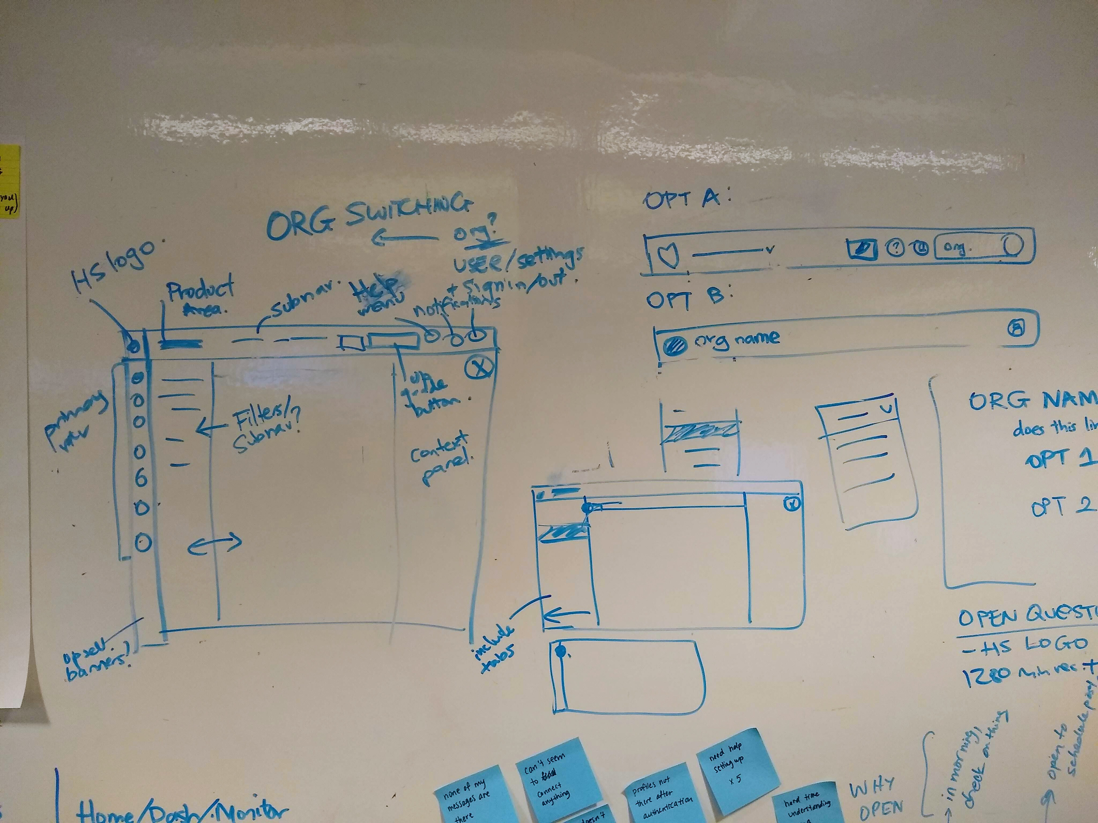
Quick collaborative sketching session
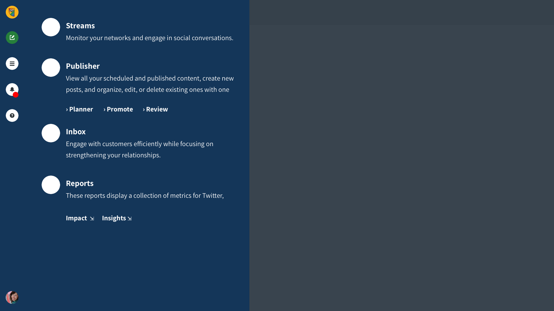
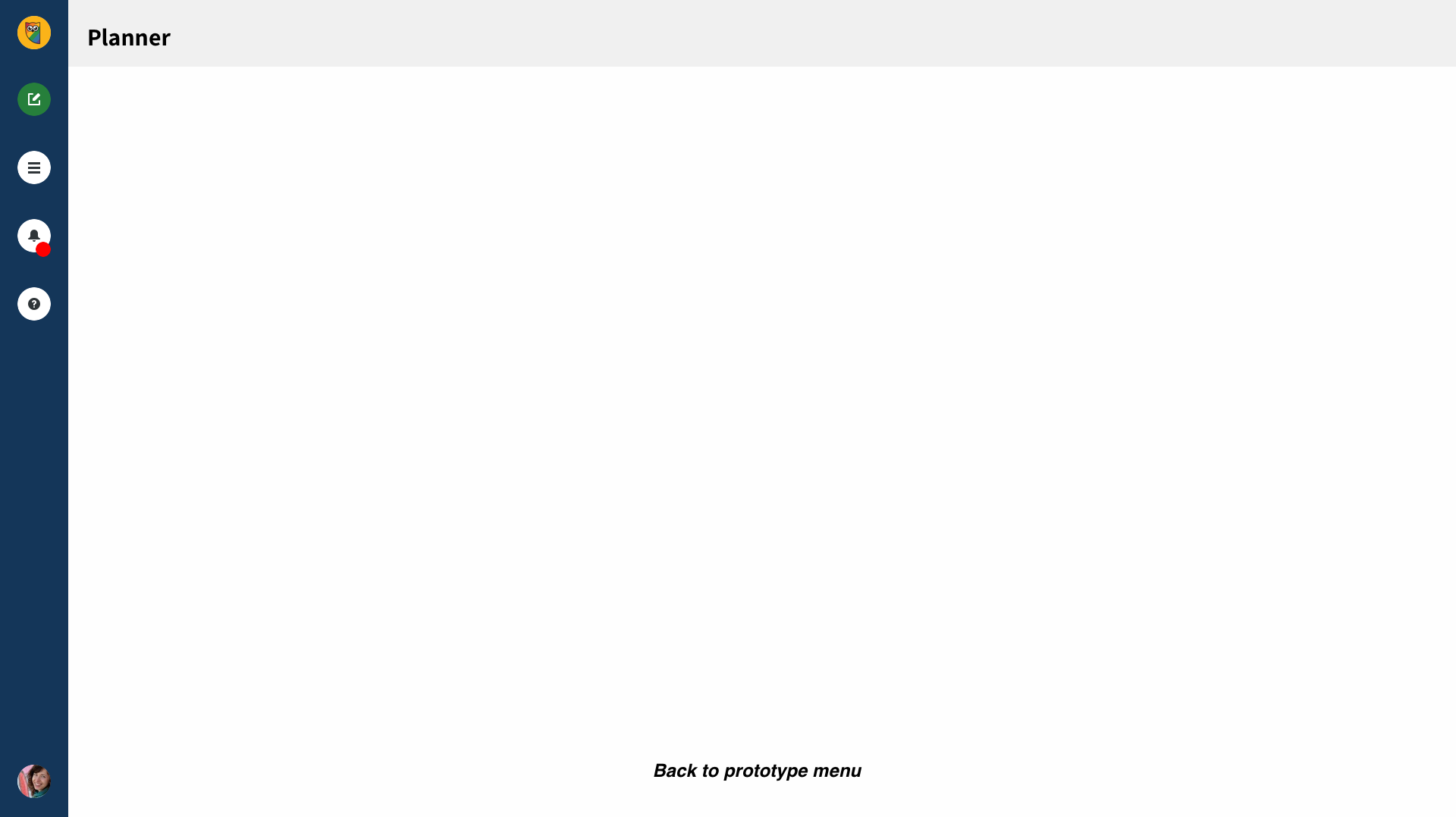
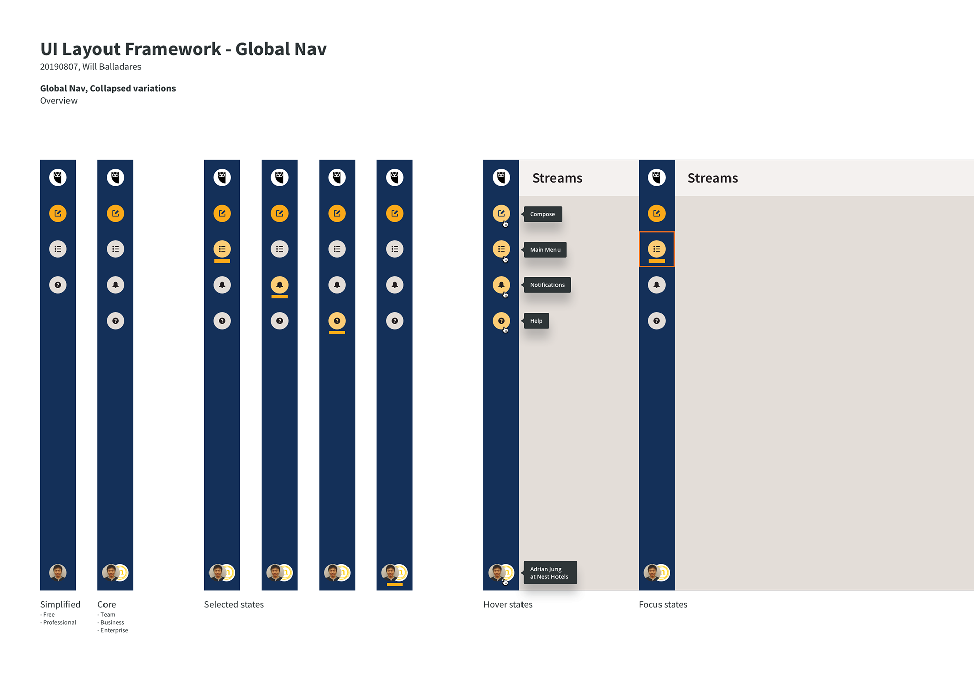
Option C is a traditional left side nav bar
Option D is a traditional horizontal top nav bar
Option A uses a full screen menu approach
Option B minimizes friction with a hamburger menu, but hides many options
Option A was a full screen menu design
Option B includes descriptions
Option C optimizes vertical space
I iterated and refined until 2 preferred options emerged. I quickly prototyped and tested the final options with our social media team. They are a small but mighty team that use our product as their everyday tool, and they gave me good 'user' insight.
The vertical left nav was the preferred option because:
✔ It saves vertical space for more content
✔ The compose button is prominently always available and always on screen
✔ It allows for more space for extended menus
✔ It's more contemporary take of UI design and it feels modern and fresh
✔ The compose button is prominently always available and always on screen
✔ It allows for more space for extended menus
✔ It's more contemporary take of UI design and it feels modern and fresh
Initial ideas for the colour scheme of the nav
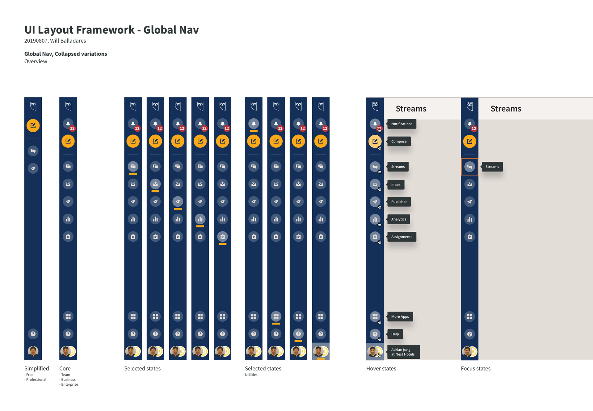
How the nav evolved after extracting items outside of the hamburger menu
A couple more improvements:
➜ Expose the nav items outside of the hamburger drawer to encourage discovery
➜ Create areas for navigation and for tooling to separate tasks
➜ Accommodate the differences of each plan types
➜ Create areas for navigation and for tooling to separate tasks
➜ Accommodate the differences of each plan types
Now, it was time to put the designs in front of our real users.
Study Goals:
➜ Validate the navigation of the UI Refresh, to ensure that it does not negatively impact any navigation/usability metrics compared to existing navigation.
➜ Don’t break anything!
Testing
I teamed up with Hana, our usability specialist, to run our final designs through a benchmark study. We used usertesting.com and tested the current status of the product against the new design (Benchmark 1).
We built prototypes for both current state (control) and the new design in Figma to remove as much bias as possible.
• 14 participants for each study, for a total of 42.
• 7 participants were Hootsuite users, and 7 were not.
• 7 participants were Hootsuite users, and 7 were not.
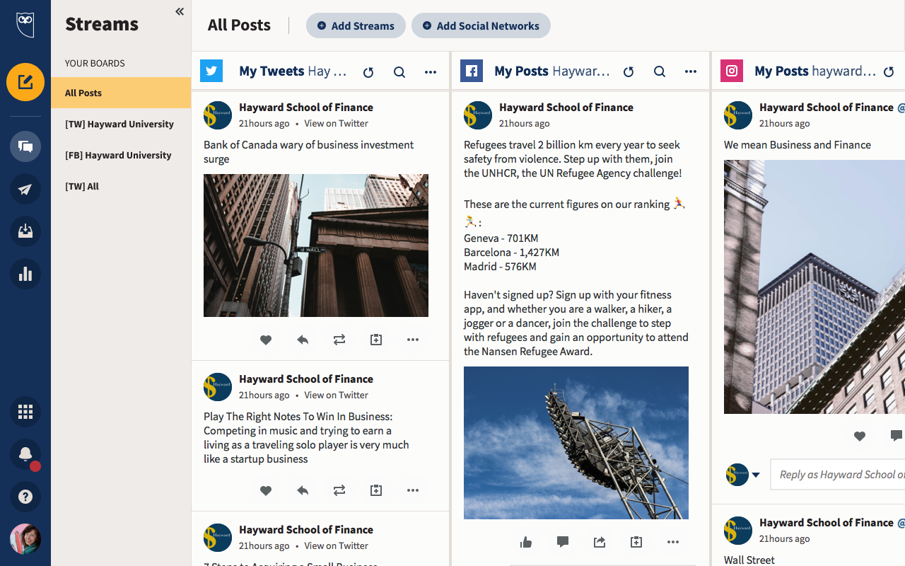
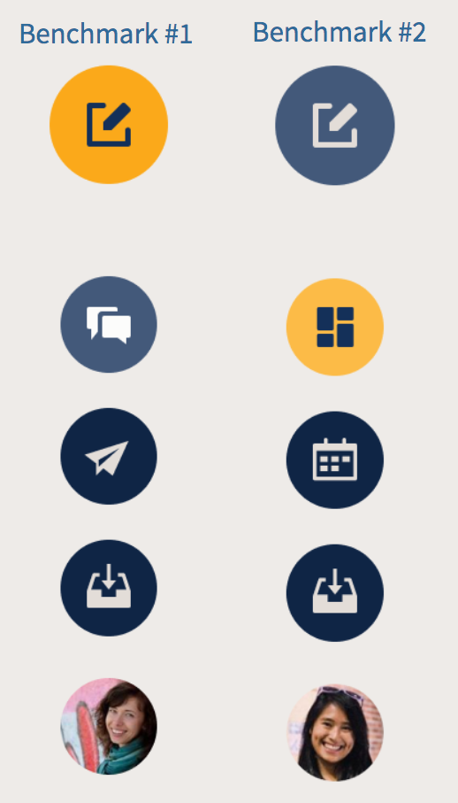
A view of the Streams page with the navigation design of Benchmark 1
Methodology
We wanted to measure efficiency (time to complete task) as well as rapid usability scoring. Key questions to answer:
• How findable are key menu items?
• How learnable are places they have already visited?
• How discoverable are other related areas?
• How learnable are places they have already visited?
• How discoverable are other related areas?
A view of the changes made to the study.
Results
The first testing results were mixed and disappointing, with only slight success rates in 7/8 tasks. Our specialist recommended some improvements to increase chances of higher success rates.
People were confused by some of the icons of the nav. Unsurprisingly, these icons had been in use for more than 5 years with no change. So we ran a quick icon card sorting exercise. With 89 responses, the new study gave us a set of clear winners to test with.
The selected state wasn't clear enough and the bright CTA button in the nav was confusing to people. I inverted the colours and refined the CTA to decrease its brightness, and increase its size in return.
The selected state wasn't clear enough and the bright CTA button in the nav was confusing to people. I inverted the colours and refined the CTA to decrease its brightness, and increase its size in return.
"Very easy to use. Even [using] a prototype, I prefer it to how it is right now. The GUI is really nice and easy to understand. The flow of everything was in point. The colors used were good as well. I was really never confused or got stumped. On point."
Existing user on Benchmark 2
"It's displaying the accounts individually in an organized fashion with a cool layout".
Non user on Benchmark 2
Final Results
Benchmark 2 slightly outperformed Benchmark 1 on key tasks. Some tasks saw a reduction of up to 20 seconds per task.
Common terms used:
• 'Straightforward'
• 'Nice colors'
• 'Clean/Clear'
• 'Easy to use'
• 'Organized/Well laid out'
• 'Straightforward'
• 'Nice colors'
• 'Clean/Clear'
• 'Easy to use'
• 'Organized/Well laid out'
Our specialist recommends moving ahead with Benchmark 2.
Execution.
How did we build this?
How did we build this?
Collaborating with multiple teams was the key to a successful high quality delivery on budget and on time.
1. Global office
The implementation team was based in Bucharest, Romania. They are 9 hours ahead, so overlap with PST region was limited. Moving our schedules ahead by a couple hours was a minor but very impactful strategy.
The implementation team was based in Bucharest, Romania. They are 9 hours ahead, so overlap with PST region was limited. Moving our schedules ahead by a couple hours was a minor but very impactful strategy.
2. Agile communication
Each portfolio team would always have to be on the know of changes to their area and understand the impact. We met with each team on a bi-weekly cadence to make sure we didn't miss anything. I also made myself available in every Slack channel as required, participating in dozens of conversations at the same time.
Each portfolio team would always have to be on the know of changes to their area and understand the impact. We met with each team on a bi-weekly cadence to make sure we didn't miss anything. I also made myself available in every Slack channel as required, participating in dozens of conversations at the same time.
3. Cross organization
The pace of the project by nature was really fast, which required up to date documentation and constant communication. My PM was able to organize a regular cadence that allowed me to ensure all parties involved had all the assets they needed.
The pace of the project by nature was really fast, which required up to date documentation and constant communication. My PM was able to organize a regular cadence that allowed me to ensure all parties involved had all the assets they needed.
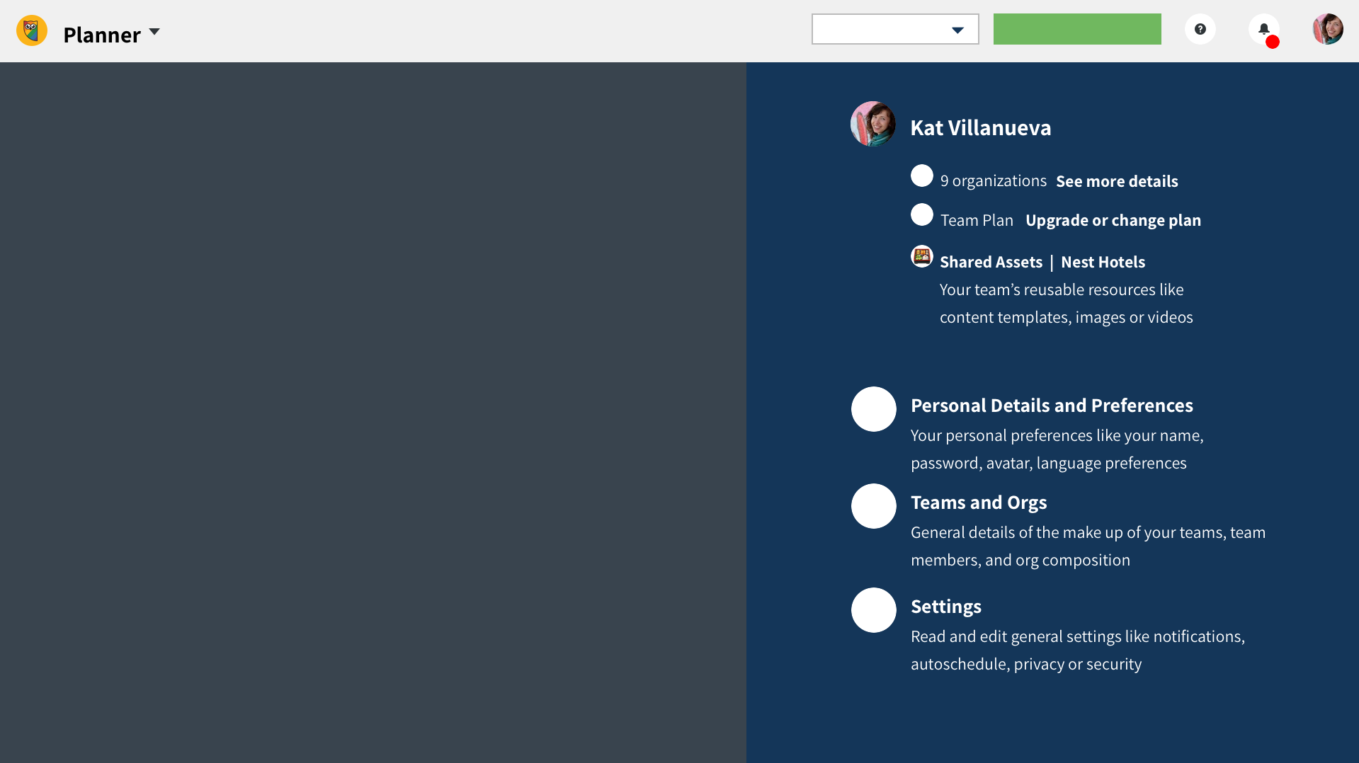
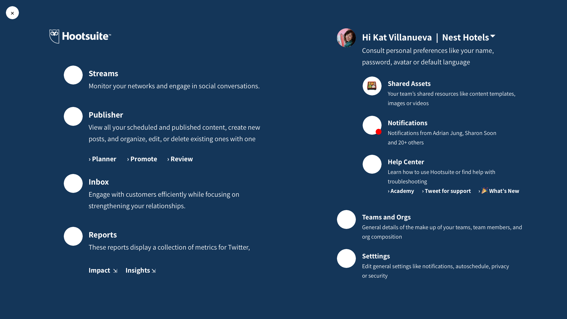
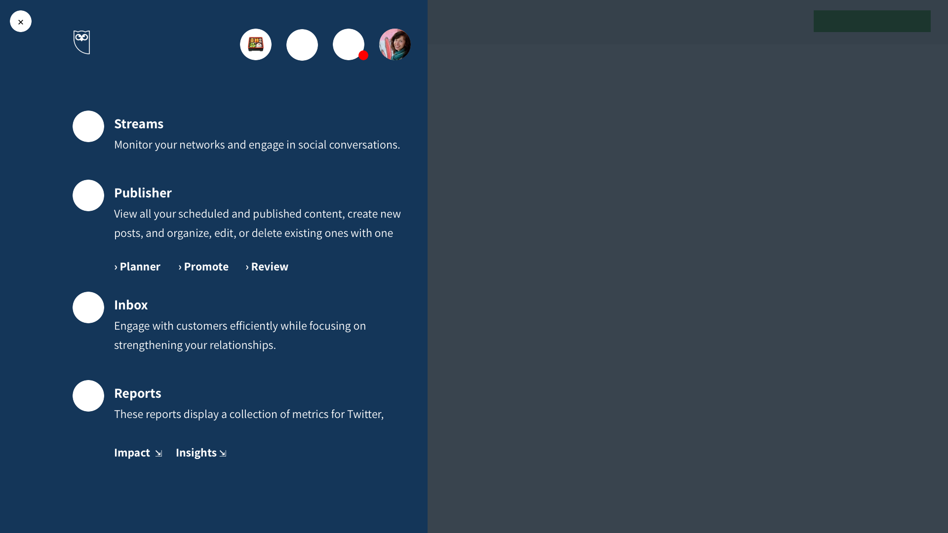
An example of design specifications of the nav in different states
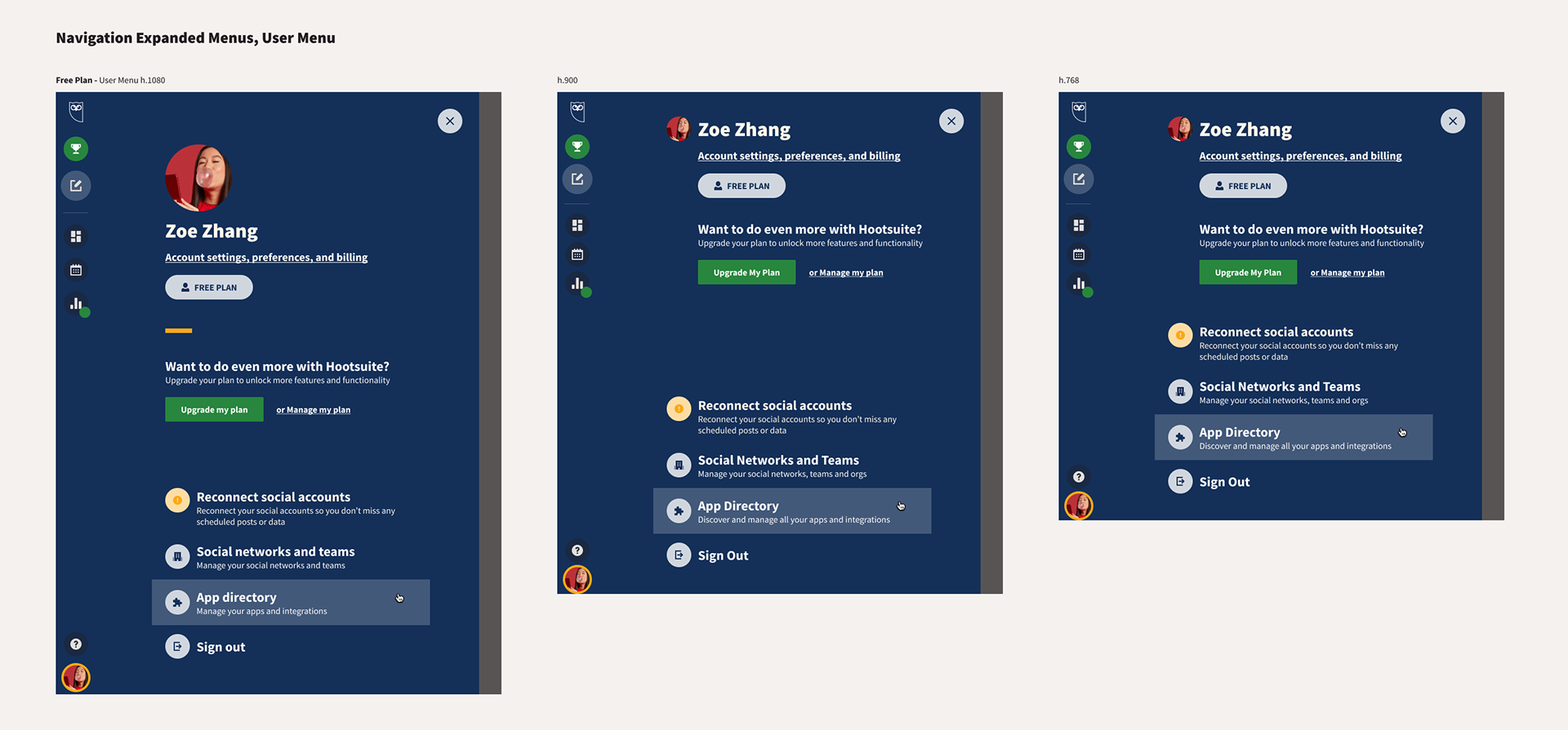
Different views of the 'My profile' menu expanded at different resolutions
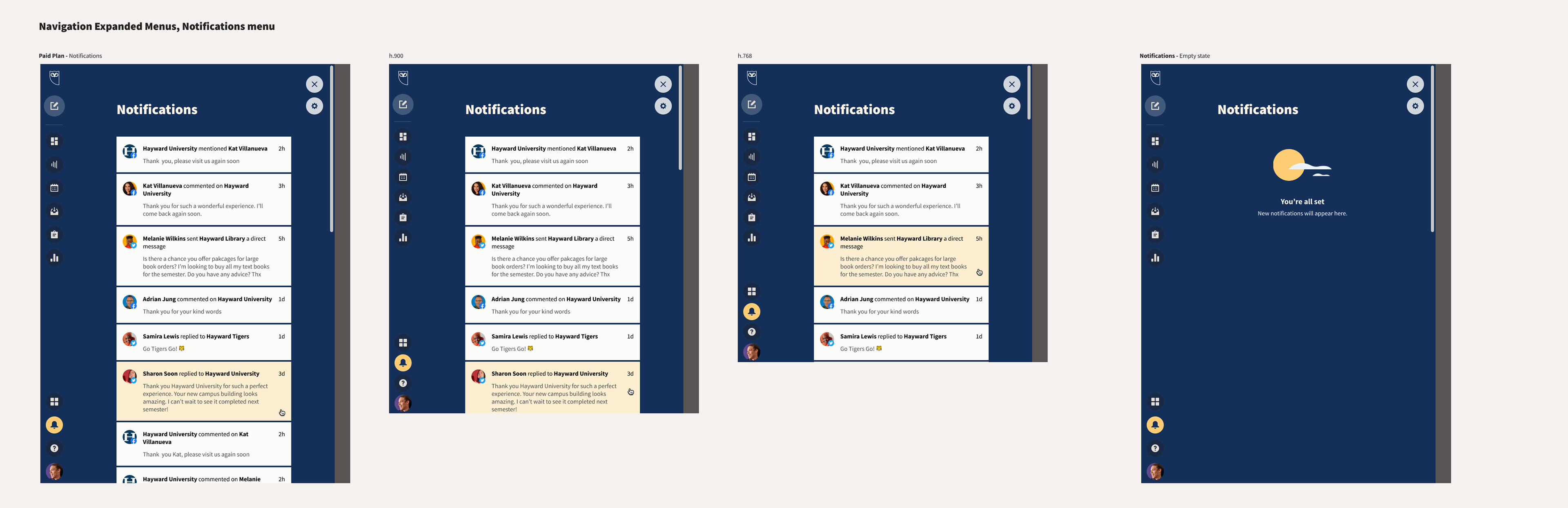
A view of the expanded Notifications menu at different resolutions
I worked with my PM and other teams to overcome challenges
Working with User Education writers to ensure improvements on internationalization and proper translations for supported languages.
Working with my PM and Product Design to ensure smooth design QA and fix bugs and defects.
Analyzing current screen usage to implement a responsive solution that can accommodate up to 95% of our user base comfortably.
Working with Growth and Retention to understand the existing different plan types and designing different versions of the nav to accommodate each.
Working with Data Analytics to make sure we were able to track all the metrics already included in the nav without breaking any of the existing tracking.
Measuring success
What's next?
Measuring progression and examining areas of opportunity for further improvement.
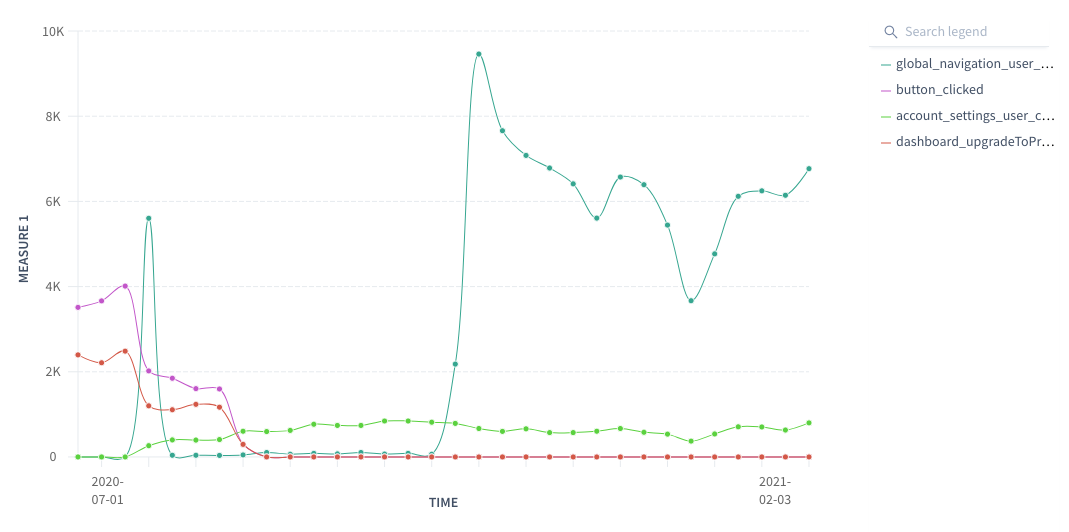
Upgrade button
We have managed to improve number of clicks of the Upgrade button by more than 5k clicks, which will translate into more conversion of trials. Still pending to find out direct correlation.
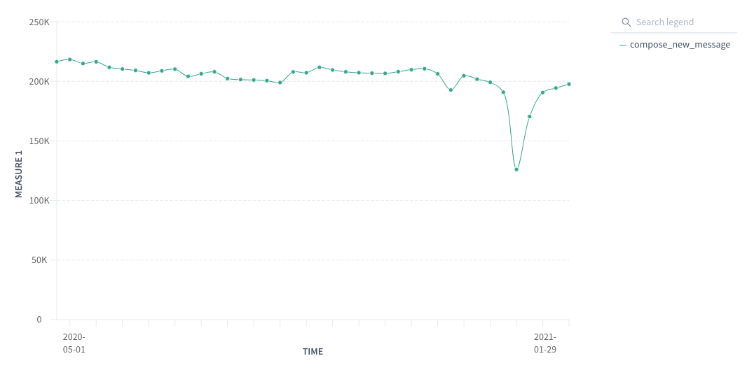
Compose button
There is a slight trend downwards on the number of clicks on compose button. We're looking at A/B testing to experiment with ways in which we can improve these numbers and reverse the trend.