The rebrand project
Hootsuite's brand new look
Out with the old… in with the new 🎉
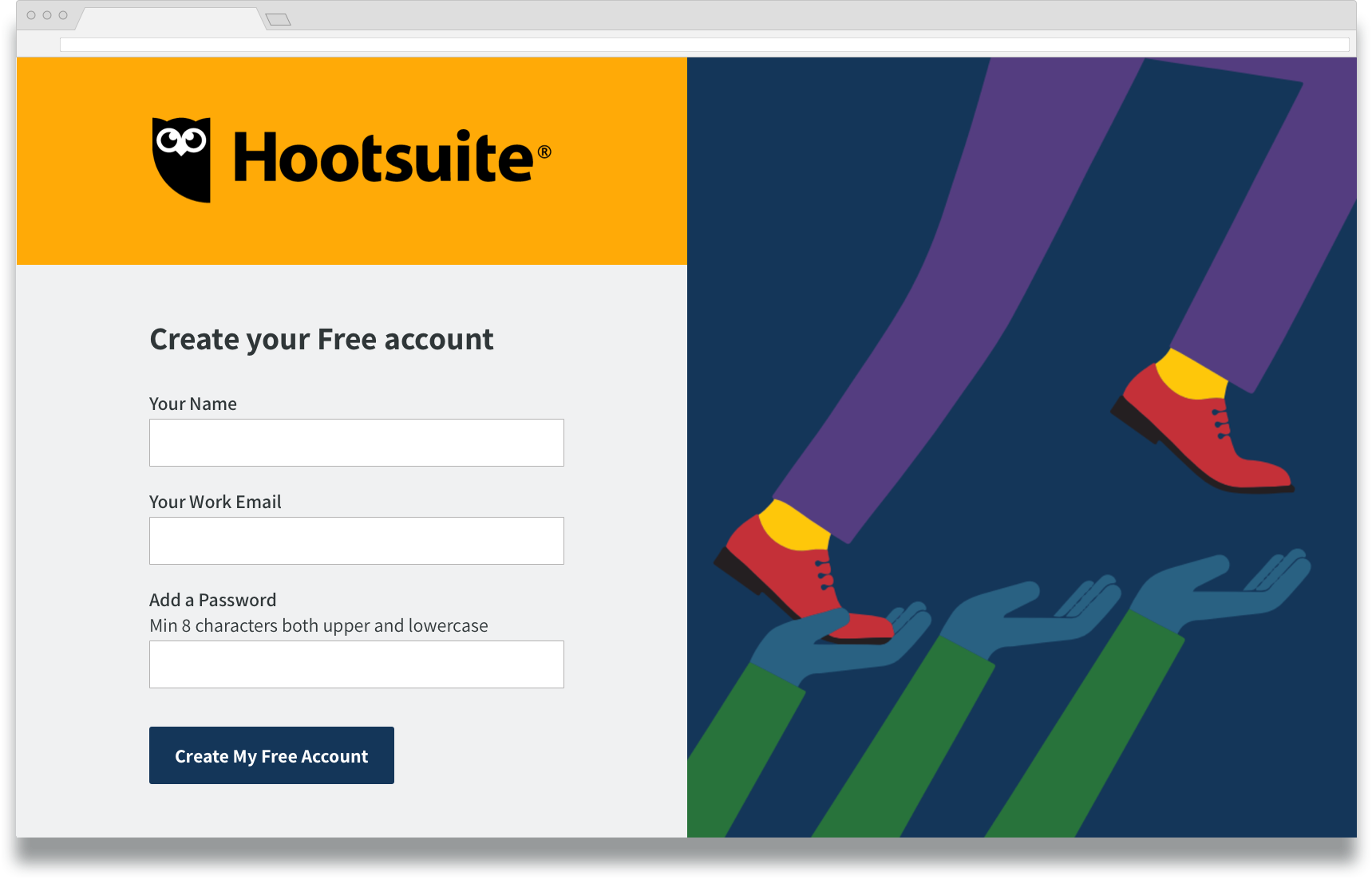
Hootsuite’s dashboard just got a brand new look and I'm excited for you to see it
Role
Lead senior designer
Lead senior designer
Collaborating with
Design: product design, user research, motion design
Product: PM, engineering, product marketing
Marketing: brand, social team
Design: product design, user research, motion design
Product: PM, engineering, product marketing
Marketing: brand, social team
When
June 2019 to August 2020
June 2019 to August 2020

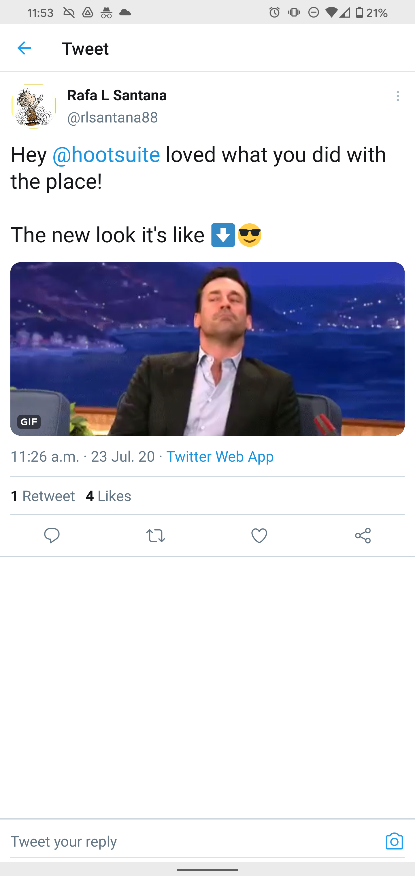
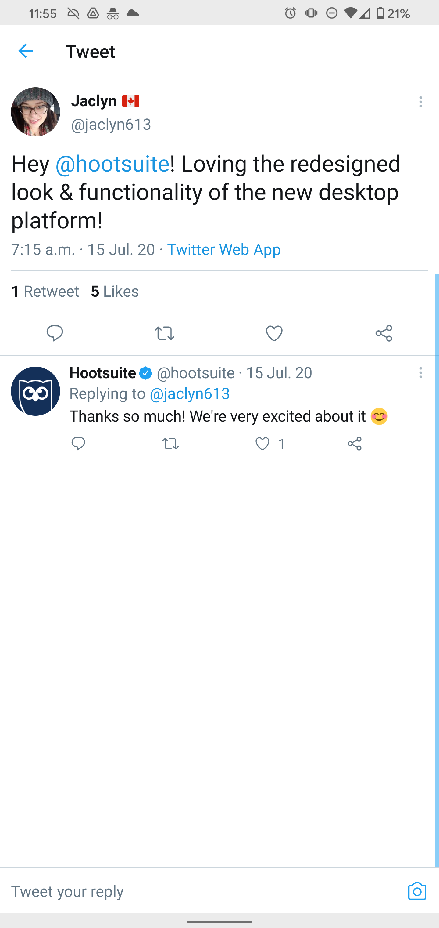
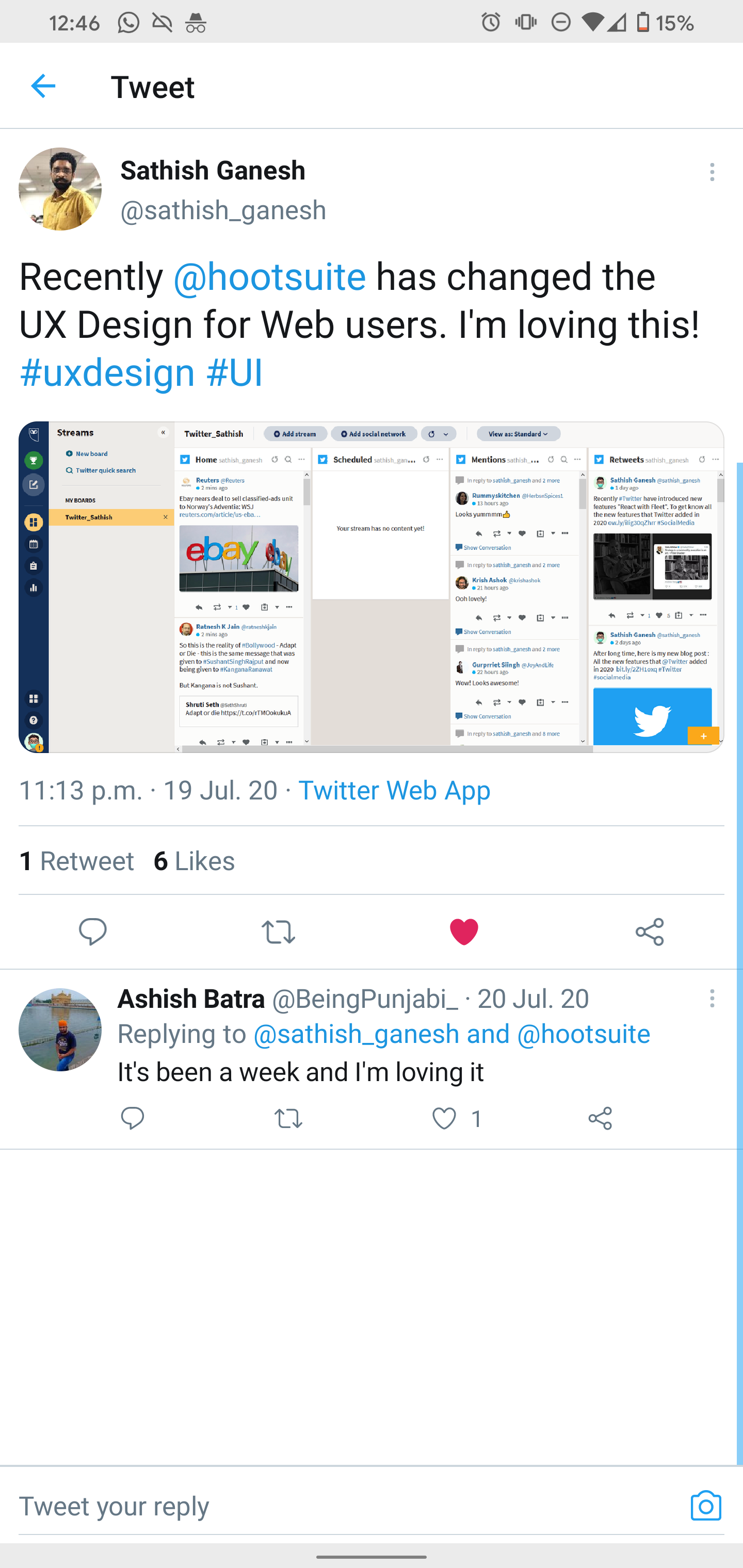
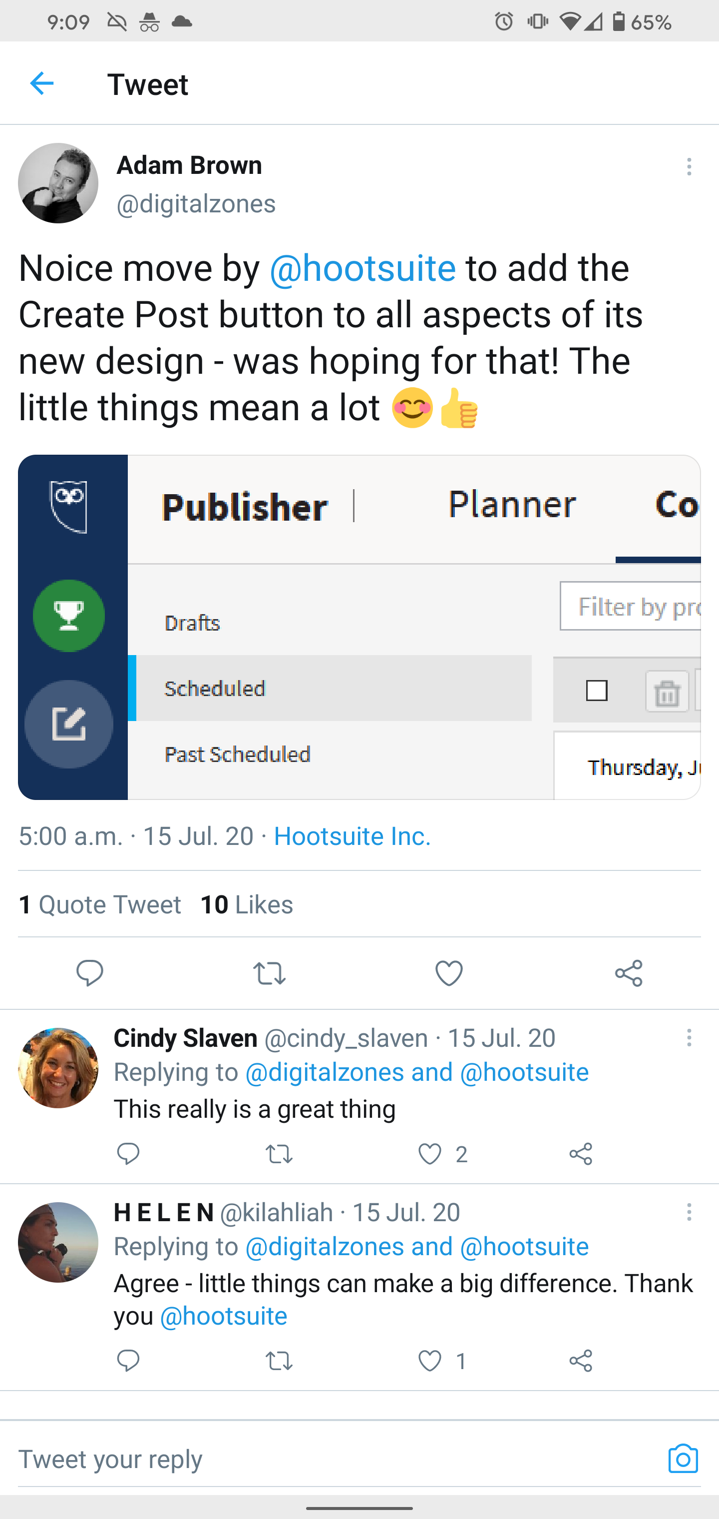
Tweet that reads My heart sank when I seen Hootsuite had changed, what crazy ideas have the devs and design team implemented now. But I love it, so happy, bug shout out and thanks to your design team Hootsuite. Love the old look but really love the new look.
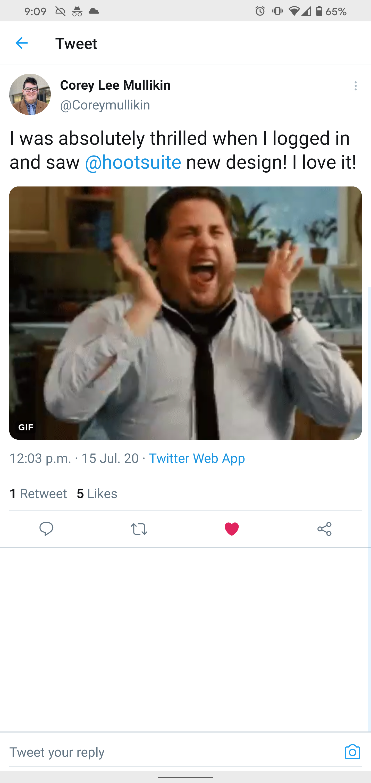
Tweet that reads I was absolutely thrilled when I logged in and saw Hootsuite new design! I love it!
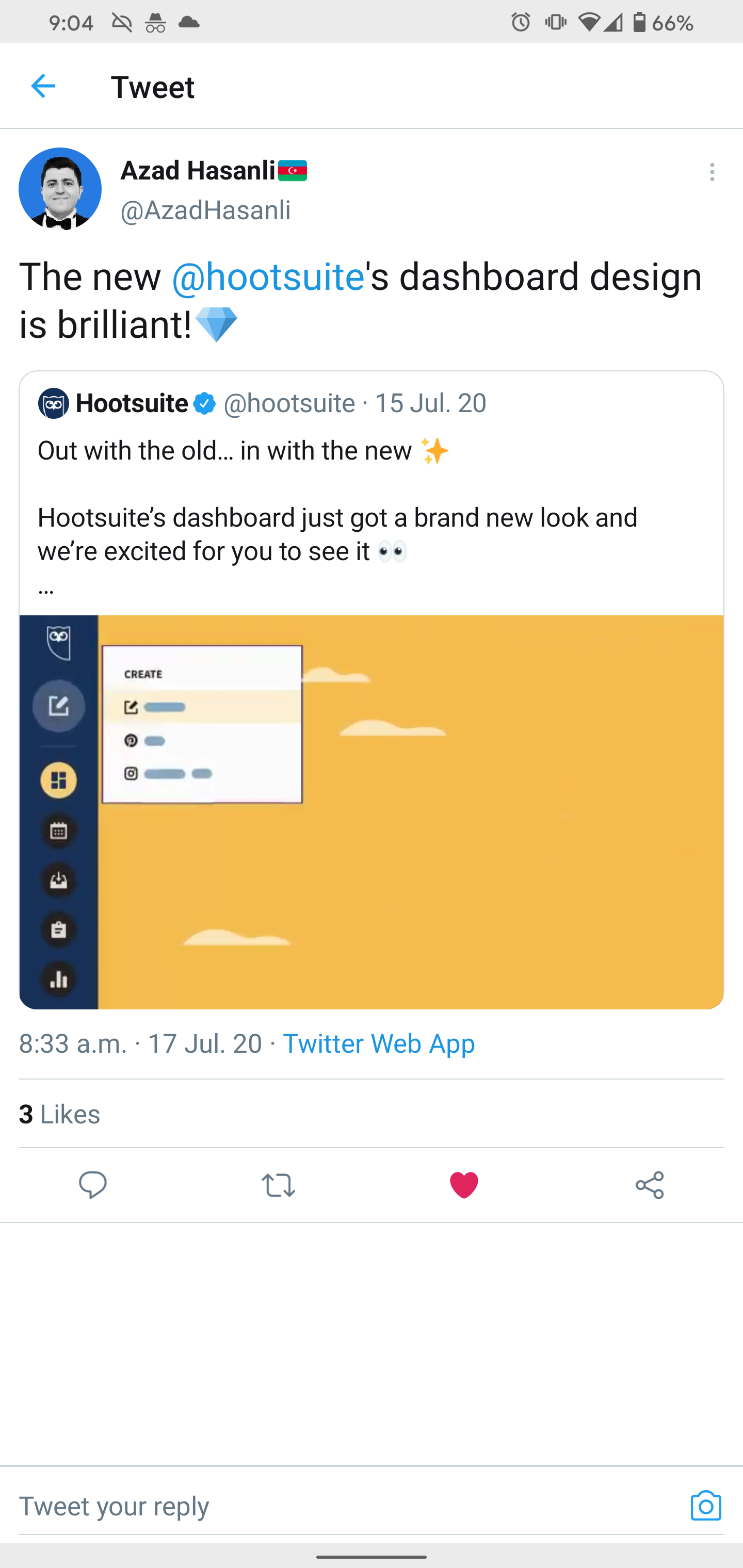
Tweet that reads the new Hootsuite's dashboard design is brilliant! Diamond emoji
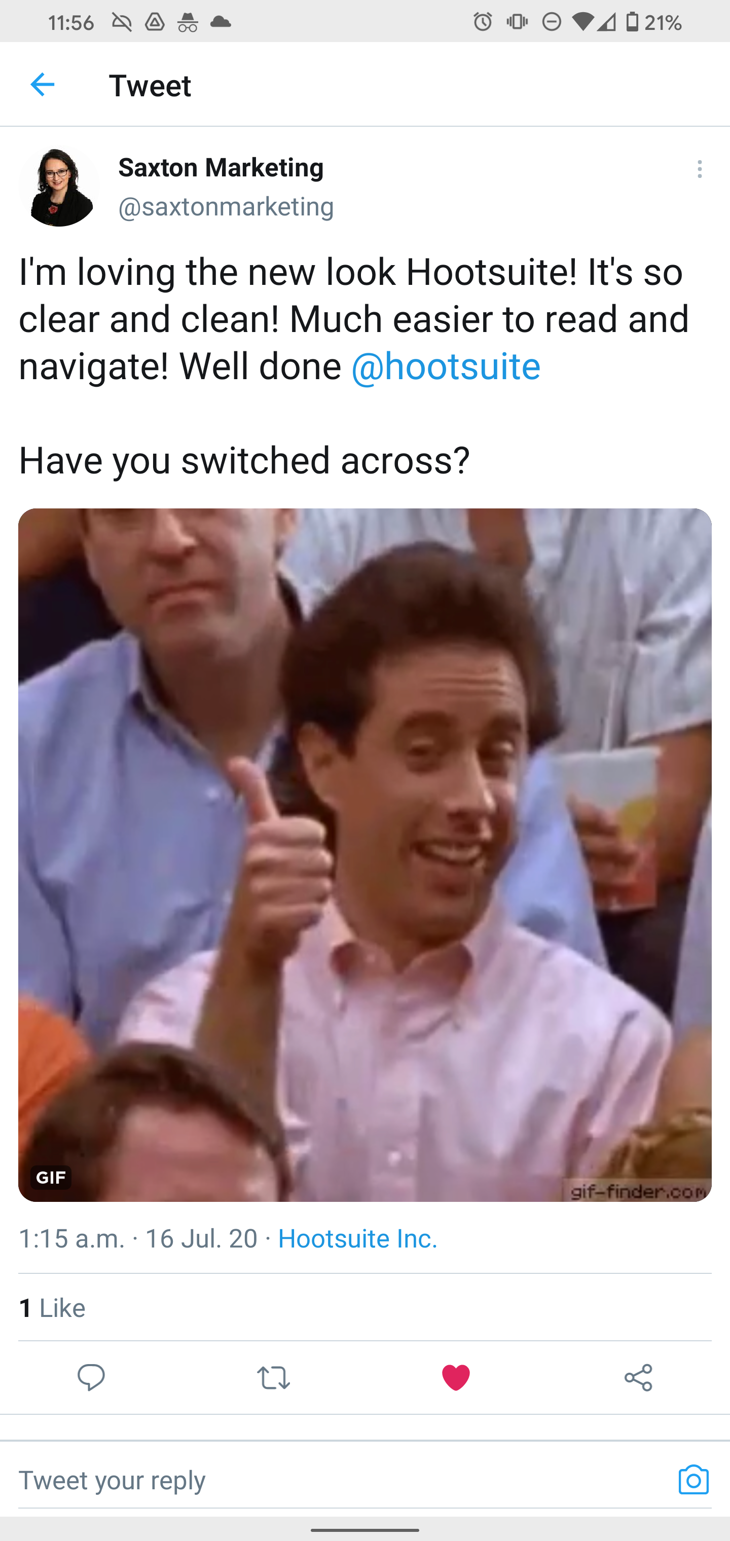
I'm loving the new look Hootsuite! It's so clear and clean! Much easier to read and navigate! Well done Hootsuite. Have you switched across?
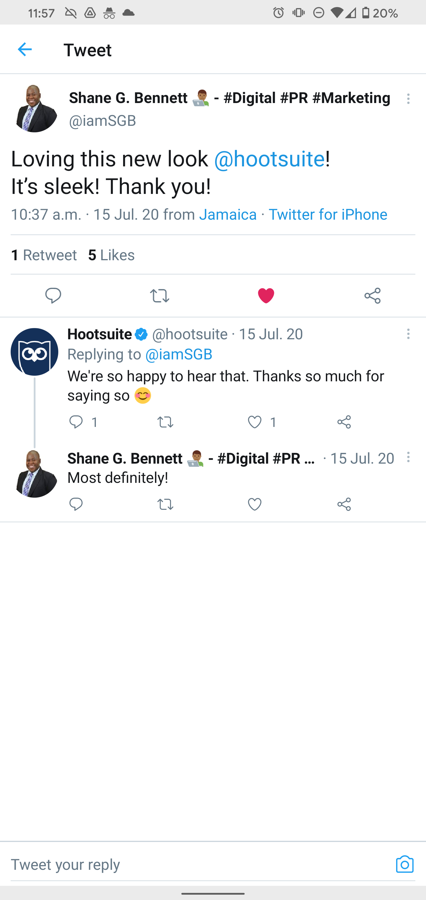
Tweet that reads Loving this new look Hotosuite! It's sleek! Thank you!

What is Hootsuite?
Hootsuite is the largest social media management platform in the world, and a big Canadian success story. Trusted by more than 18 million customers, we publish and send more than 4 million social media posts every week.
Social media managers are able to do in a single platform the simple things like curate content and schedule posts, all the way up to managing team members and measuring ROI.

Why rebrand in product?
In 2019 the Brand team introduced a new brand strategy and guidelines for Hootsuite.
As they incorporated the new branding through marketing campaigns and collateral, Hootsuite's product continued to diverge, which increased the gap between how we see ourselves and what our customers see.
We can achieve a cohesive customer experience across our company ecosystem, but only if all channels speak the same language.
In addition:
✘ UX/UI has been a top detractor for both enterprise and self-serve NPS for at least the past 8 quarters, and most recently surfacing as a top product issue for sales teams.
✘ Much of the feedback in multiple channels suggests our UI is “clunky” and “overwhelming.”
✘ Much of the feedback in multiple channels suggests our UI is “clunky” and “overwhelming.”
How might we...
manifest our brand in product?
manifest our brand in product?
Strategic goals that we are pursuing
✔ Deliver a modern, cohesive and seamless end-to-end user experience
✔ Elevate our UI/UX standards and practices
✔ Improve and enhance existing product build
Process.
Understanding the problem.
Understanding the problem.

Some data to keep in mind first
577,993
Weekly active users
Weekly active users
4,239,356
Weekly scheduled messages sent
Weekly scheduled messages sent
1,717,094
Weekly live messages sent
Weekly live messages sent

Knowing our users:
1. SMB owner or single member of a social team
Plays many roles and struggles to find time.
Plays many roles and struggles to find time.
2. Members of a small social team
Dedicated to social, strive to produce high quality content
Dedicated to social, strive to produce high quality content
3. Members of a small team within a larger marketing org
They own the social strategy and want to prove the value of social
They own the social strategy and want to prove the value of social
4. Leader of the business
Is responsible for all marketing ops, and works to prove marketing ROI
Is responsible for all marketing ops, and works to prove marketing ROI

Knowing our plans:
Free plans
A big majority of our customer base
A big majority of our customer base
Paid plans
Including Enterprise, where most of our revenue comes from
Legacy plans
Most of them are paid plans
Including Enterprise, where most of our revenue comes from
Legacy plans
Most of them are paid plans

User goals considerations:
➜ Changes need to be sober, enhance continuity and promote exploration
➜ Accommodate existing workflows and needs, don't be an obstacle➜ Improve our user's critical workflows whenever possible
➜ Don't hinder A-ha moment, trial engagement, or other critical metrics
➜ Help reduce support and PSAT ticket volumes, improve UX/UI health scorecard
➜ Create an outstanding experience that sales teams can use for success
Design considerations:
➜ Work with Brand to define the new design language, including visual design direction
➜ Make sure that it's a system that works for ALL current areas of product
➜ Make sure that it's a system that scales for the long term - future proof.
➜ Make it accessible
➜ Have fun
Product considerations:
➜ Work with PMs and other stakeholders to clarify scope, requirements and resources
➜ Connect with all product areas and be aware of the different tech stacks
➜ Be proactive and anticipate risks. Provide solutions and pivot when needed
➜ Engage all areas of Product, Design, Marketing and others in the process
➜ Make engineers and front-dev feel welcomed and empowered to contribute

Organization
Structure
We had 3 areas of interest. Due to budget constraints, we had to reduce our scope and focus on high impact changes with low cost.
This was a painful reality check.
✔ 1. Global nav rebuild
● Update how our main navigation presents itself
● Unify and consolidate navigational patterns
● Re-architecture of the component
● Unify and consolidate navigational patterns
● Re-architecture of the component
✔ 2. UX/UI update
● New design language
● A direction and a destination for all in product
● Improving the overall experience where possible
● Updating front end and UI components
● Collaborative with all teams in Product
● A direction and a destination for all in product
● Improving the overall experience where possible
● Updating front end and UI components
● Collaborative with all teams in Product
✘ 3. IA refresh
● Deep architectural changes
● Accommodate more accurate mental models
● Update UX patterns and UI in legacy areas
● Accommodate more accurate mental models
● Update UX patterns and UI in legacy areas
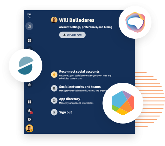
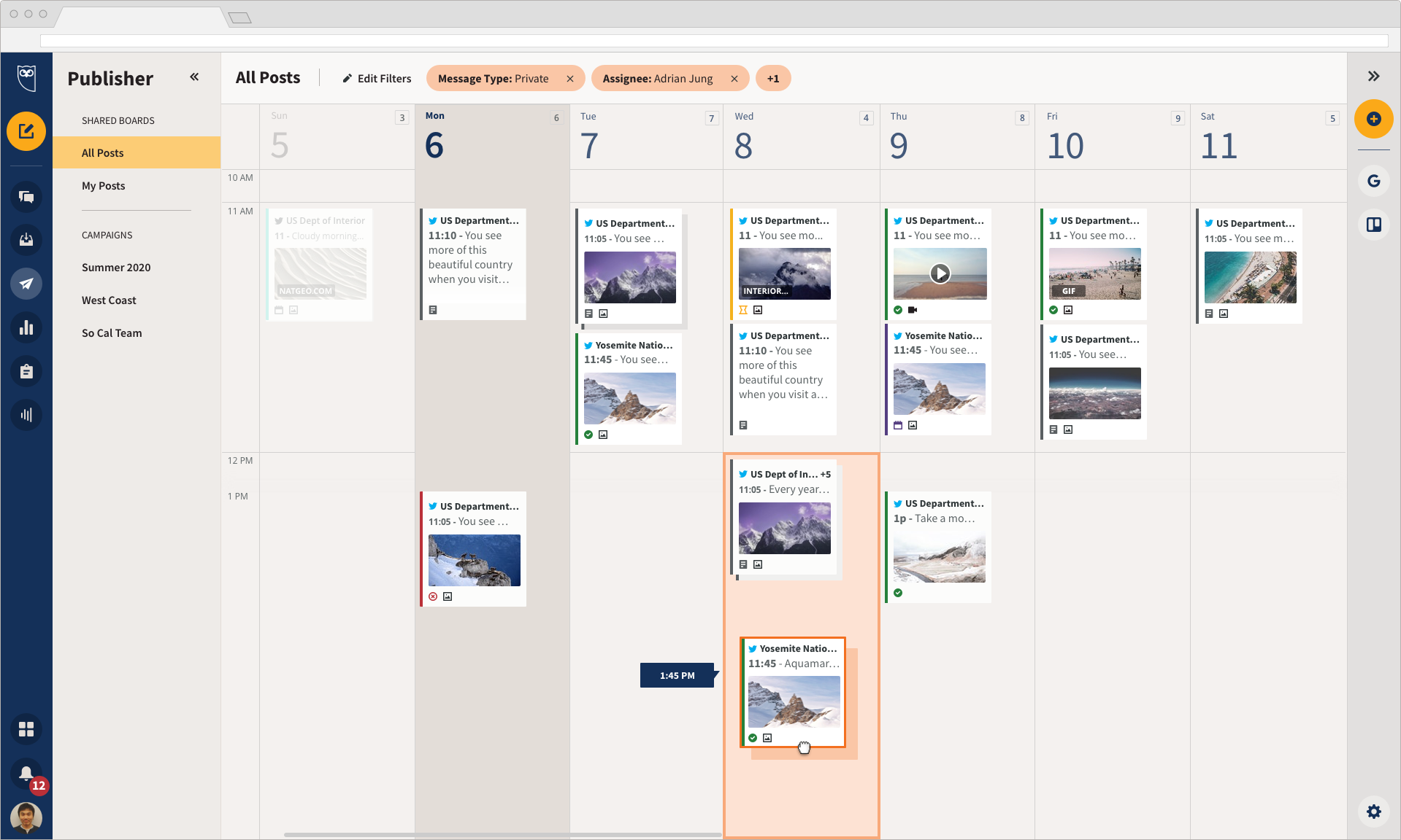
Previous state, 2019
How it started
How it started
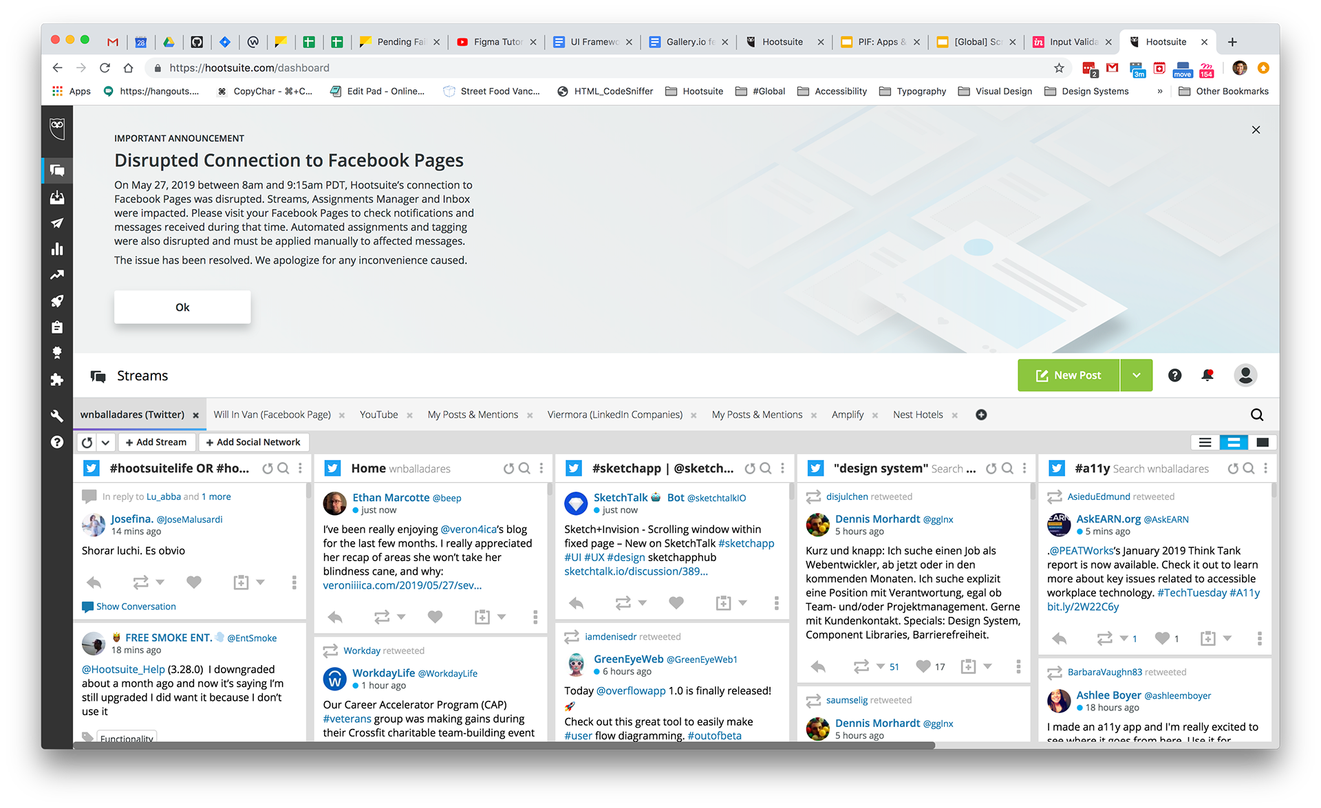
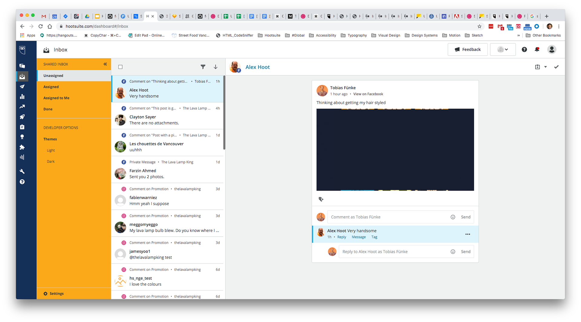
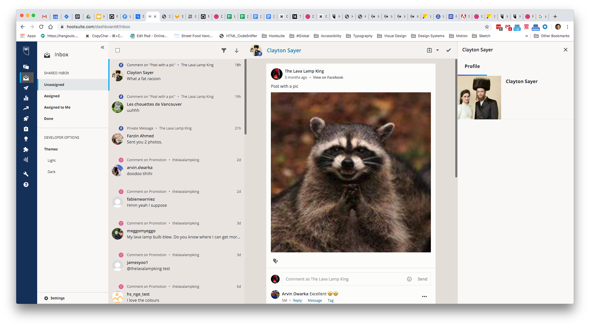
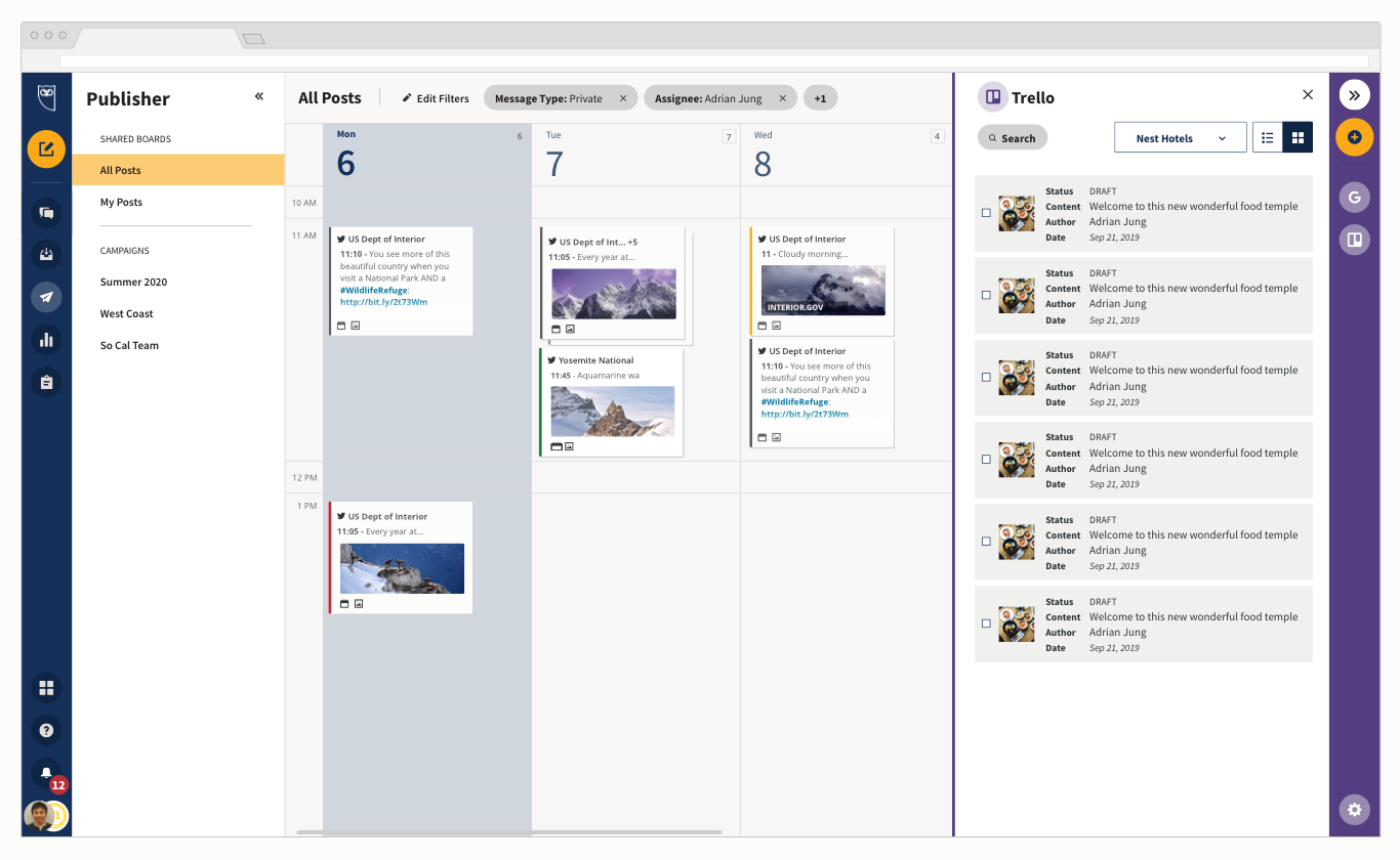
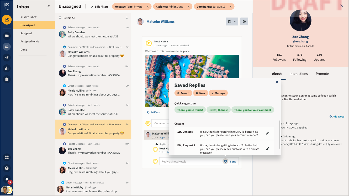
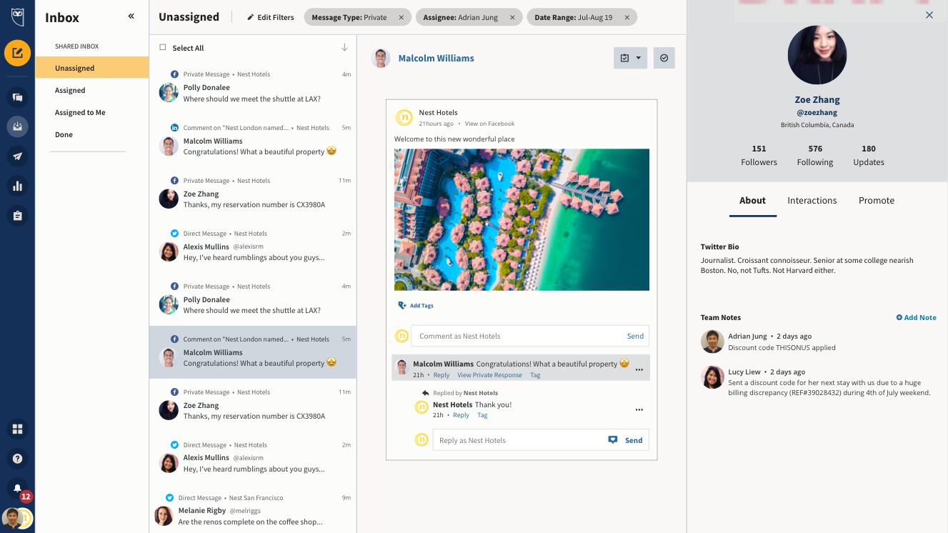
Hootsuite dashboard view, 2019.
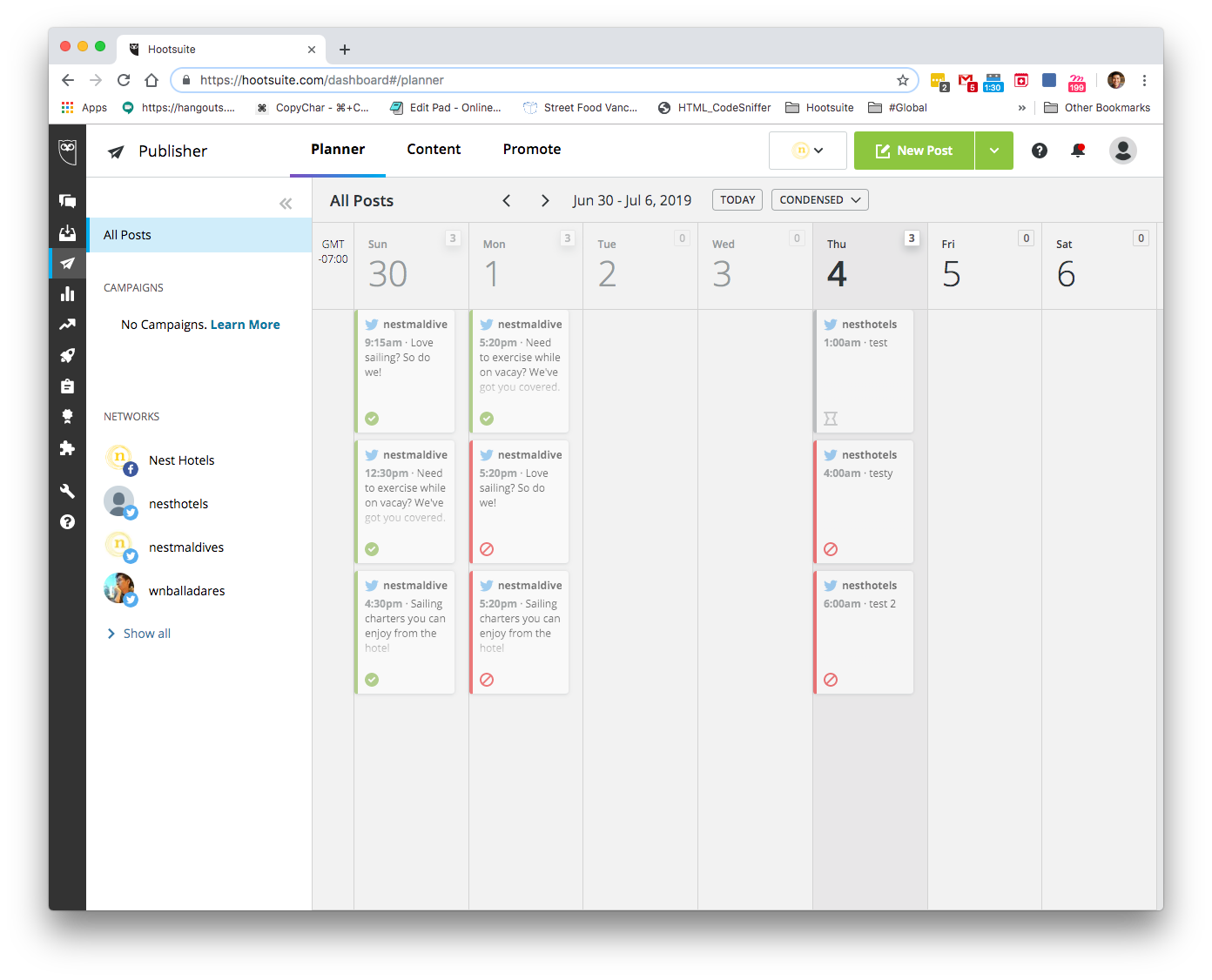
A snippet of a planner in the old UI
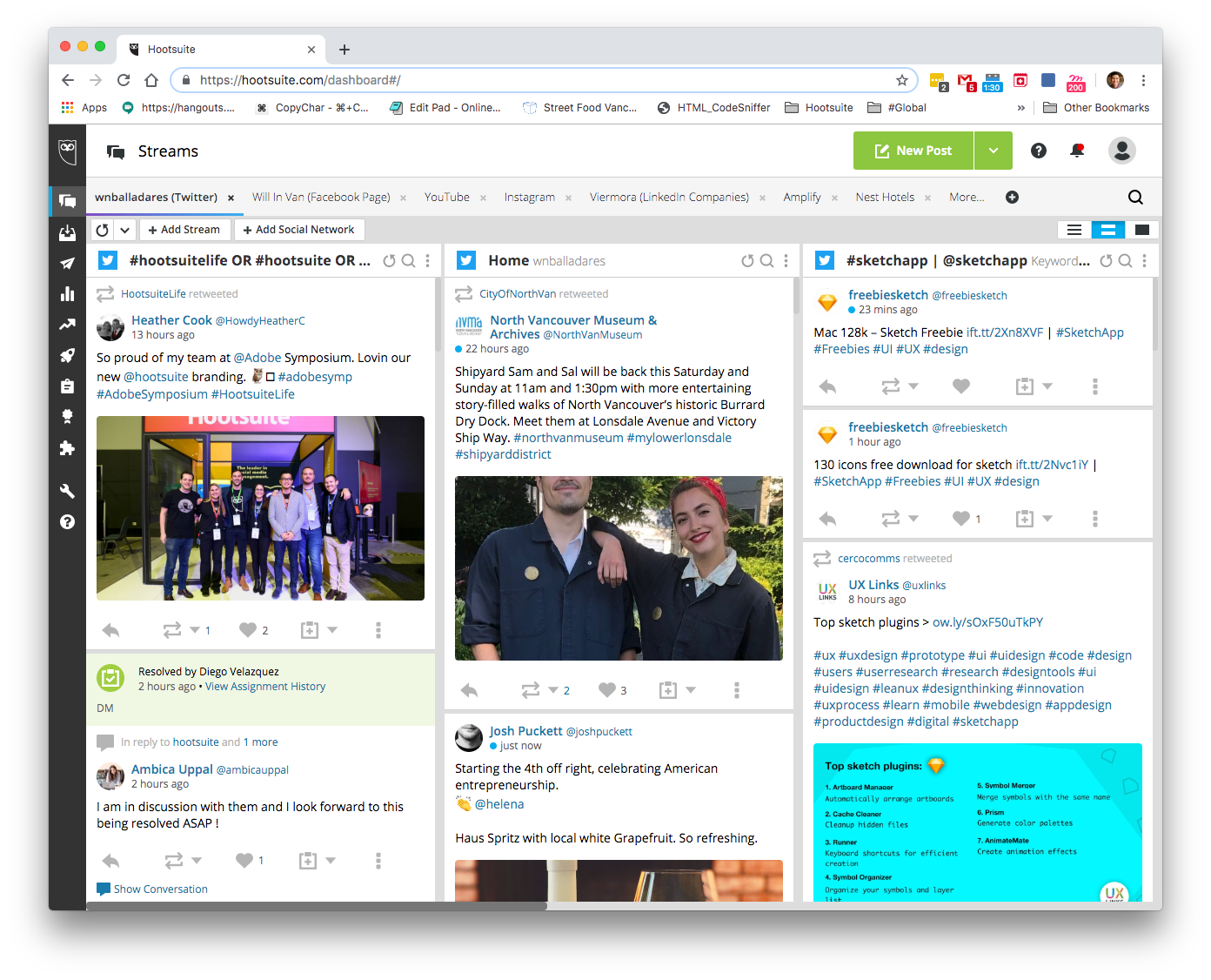
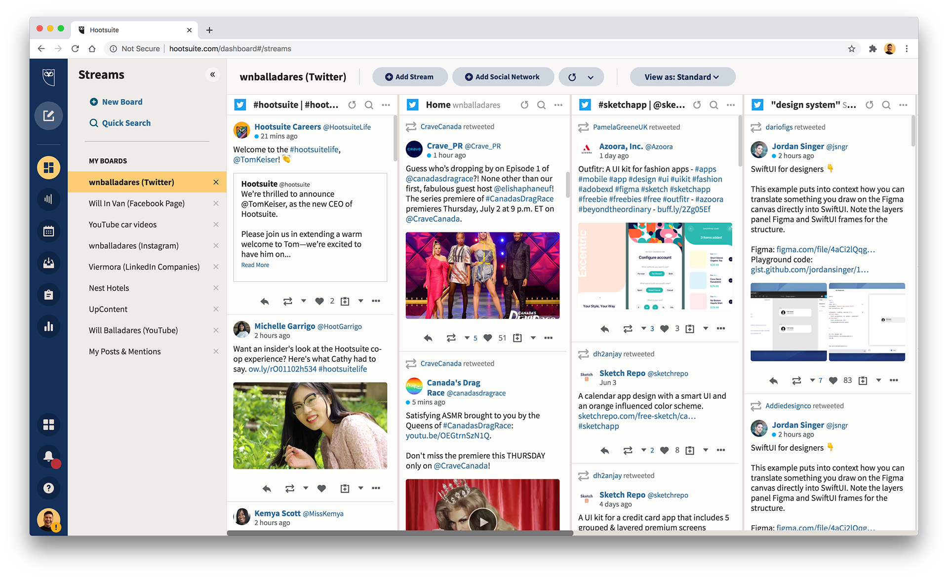
A snippet of a streams in the old UI
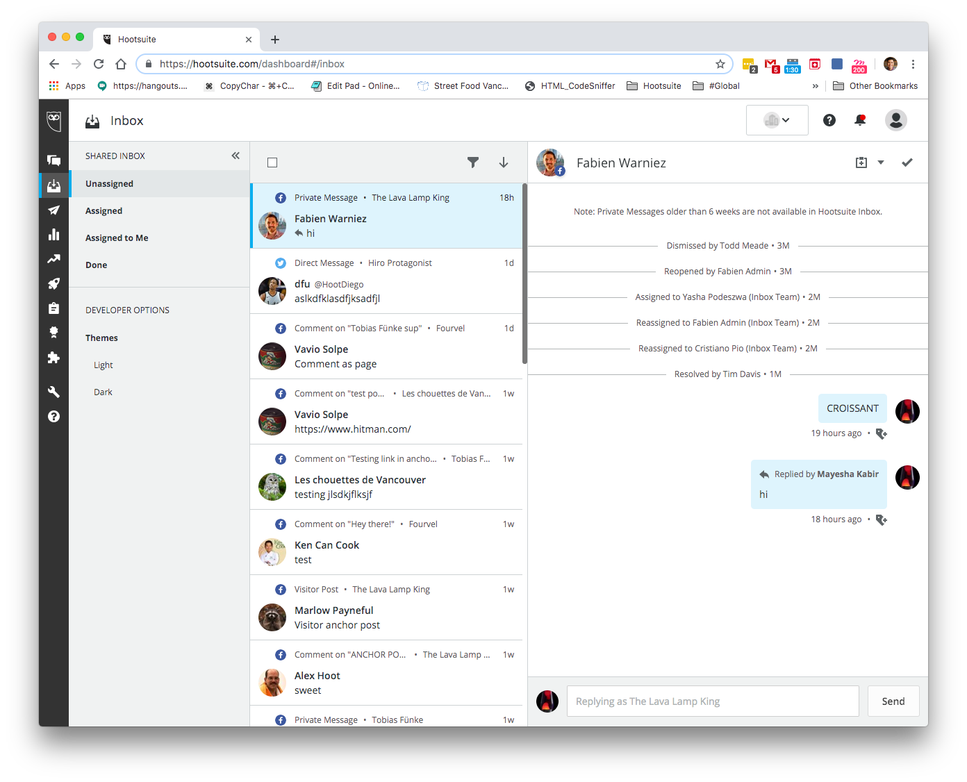
A snippet of a inbox in the old UI
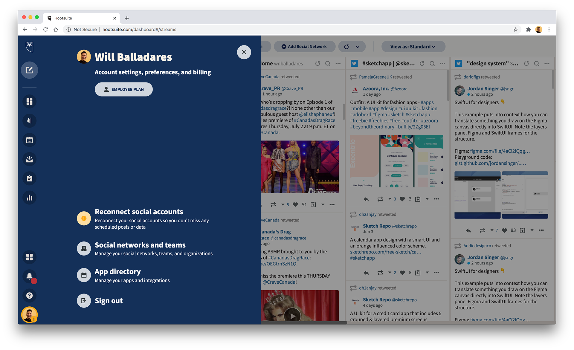
A snippet of a menu in the old UI
A snippet of a side panel in the old UI
A snippet of a social network picker in the old UI
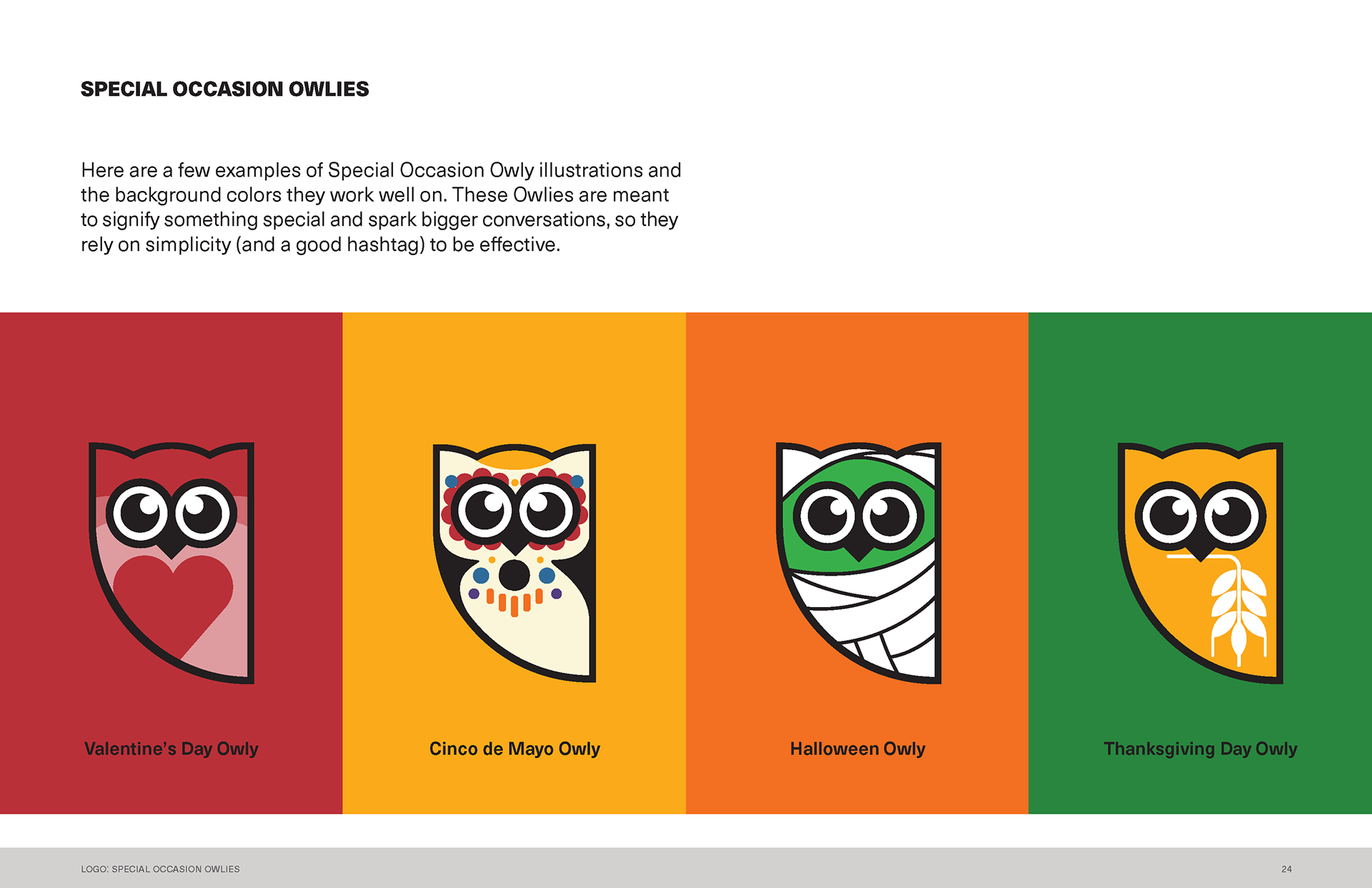
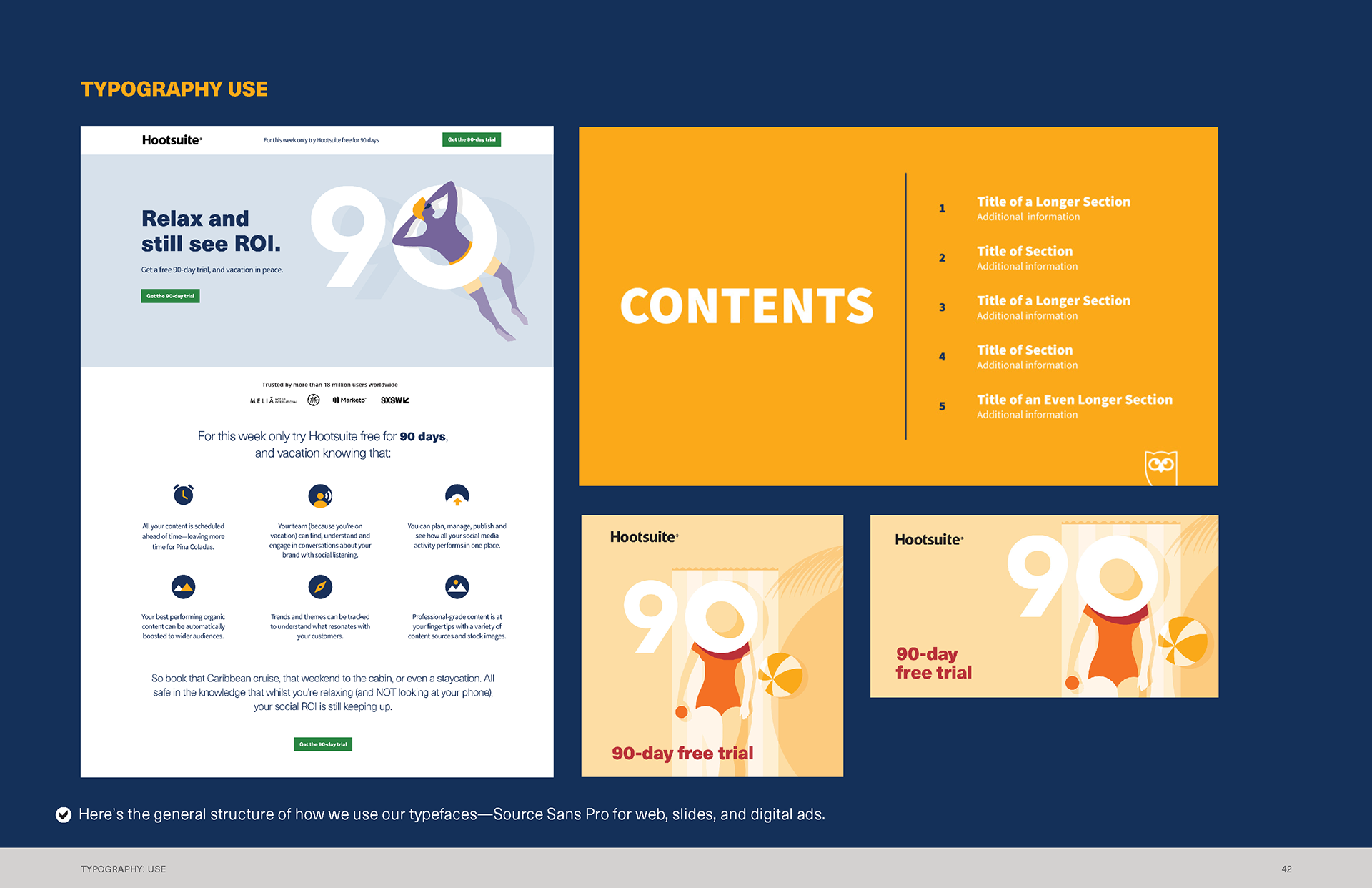
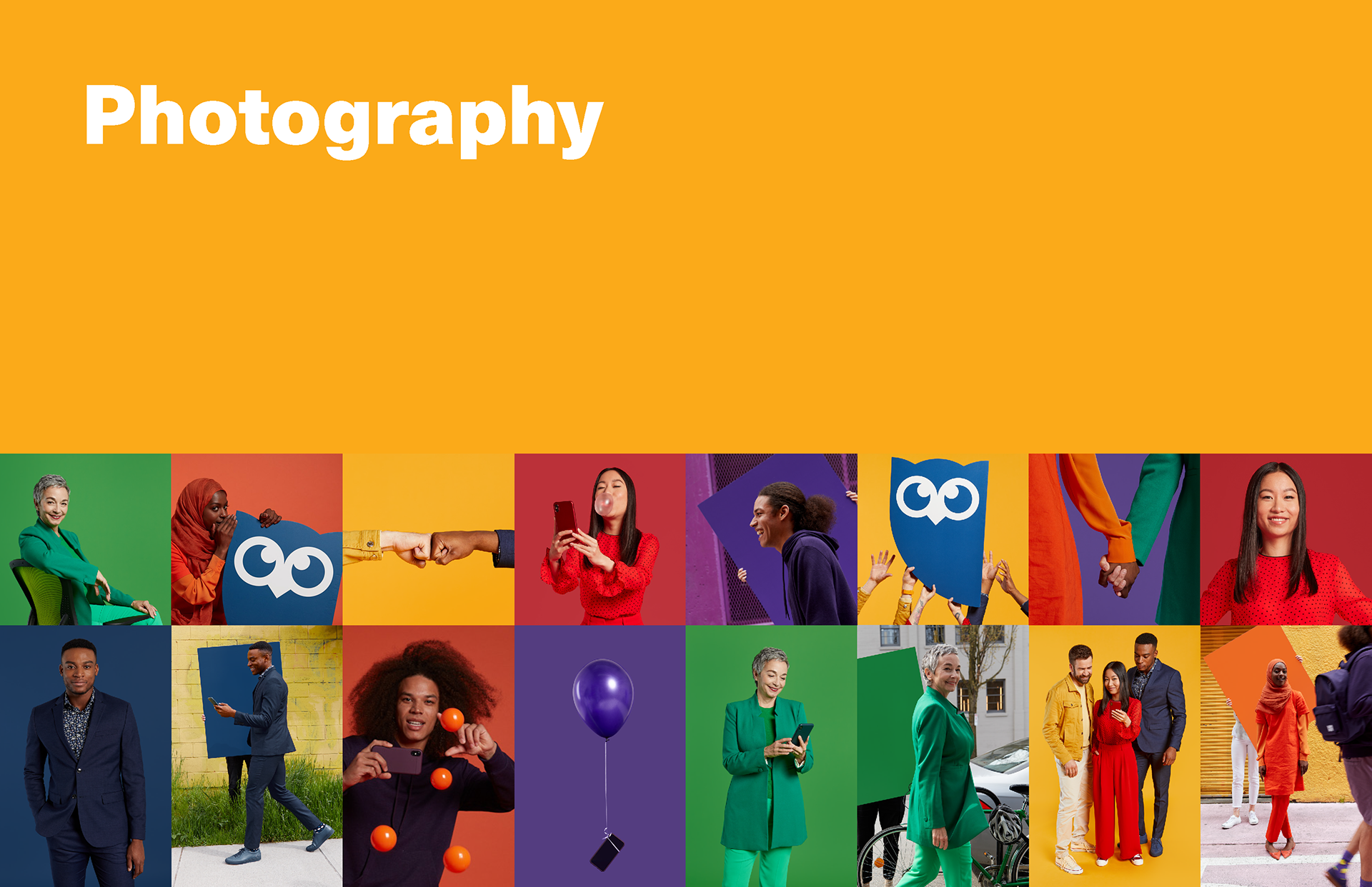
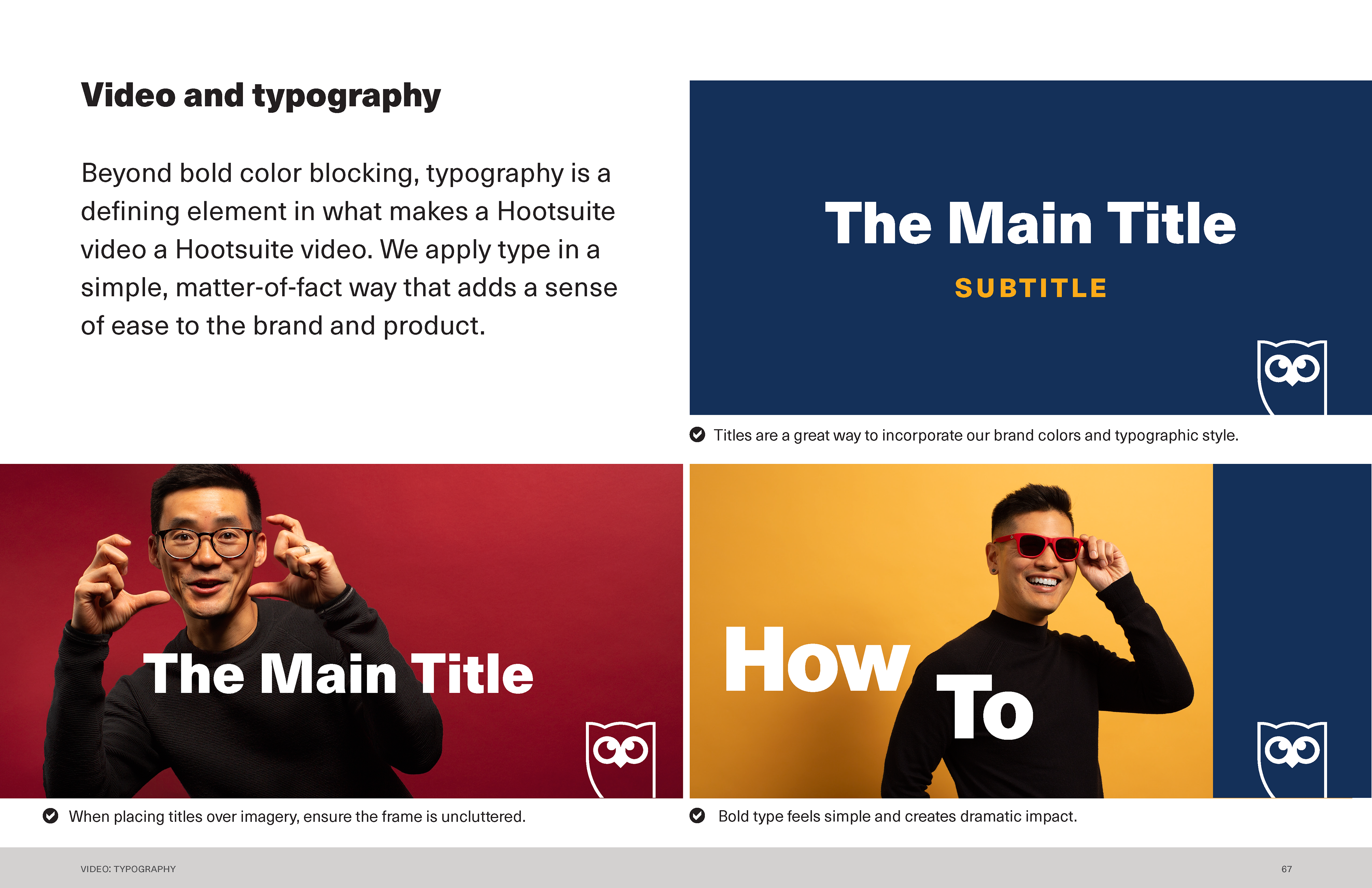
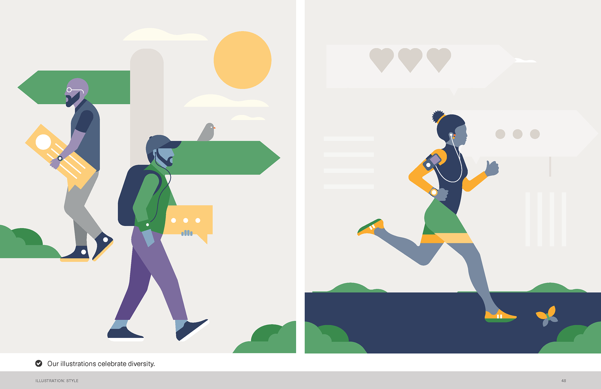
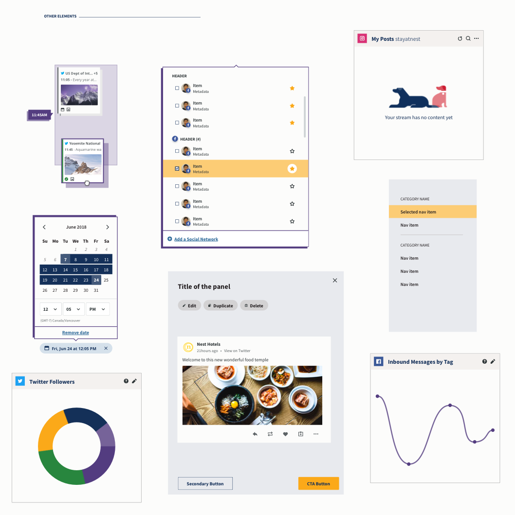
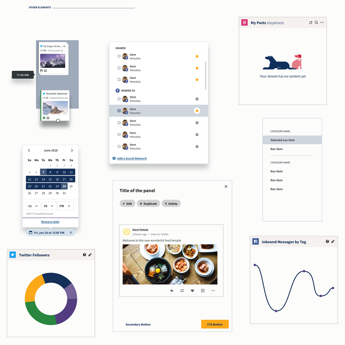
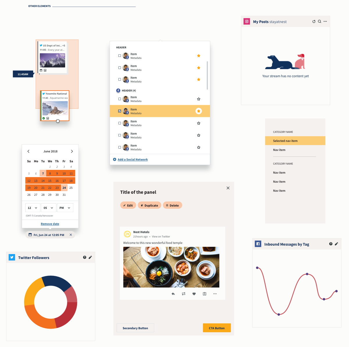
Understanding the new brand
It's human, colourful and bold
It's human, colourful and bold
Exploring...
Colour studies. How do we make this work in product...? 🤓
Colour studies. How do we make this work in product...? 🤓
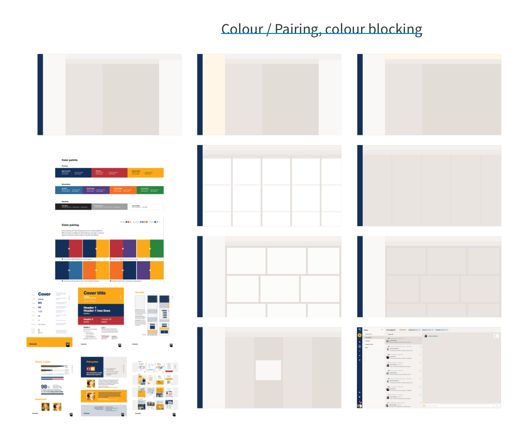
Exploration of colour layout
Exploration with colour 1
Exploration with colour 2
Concept of login page
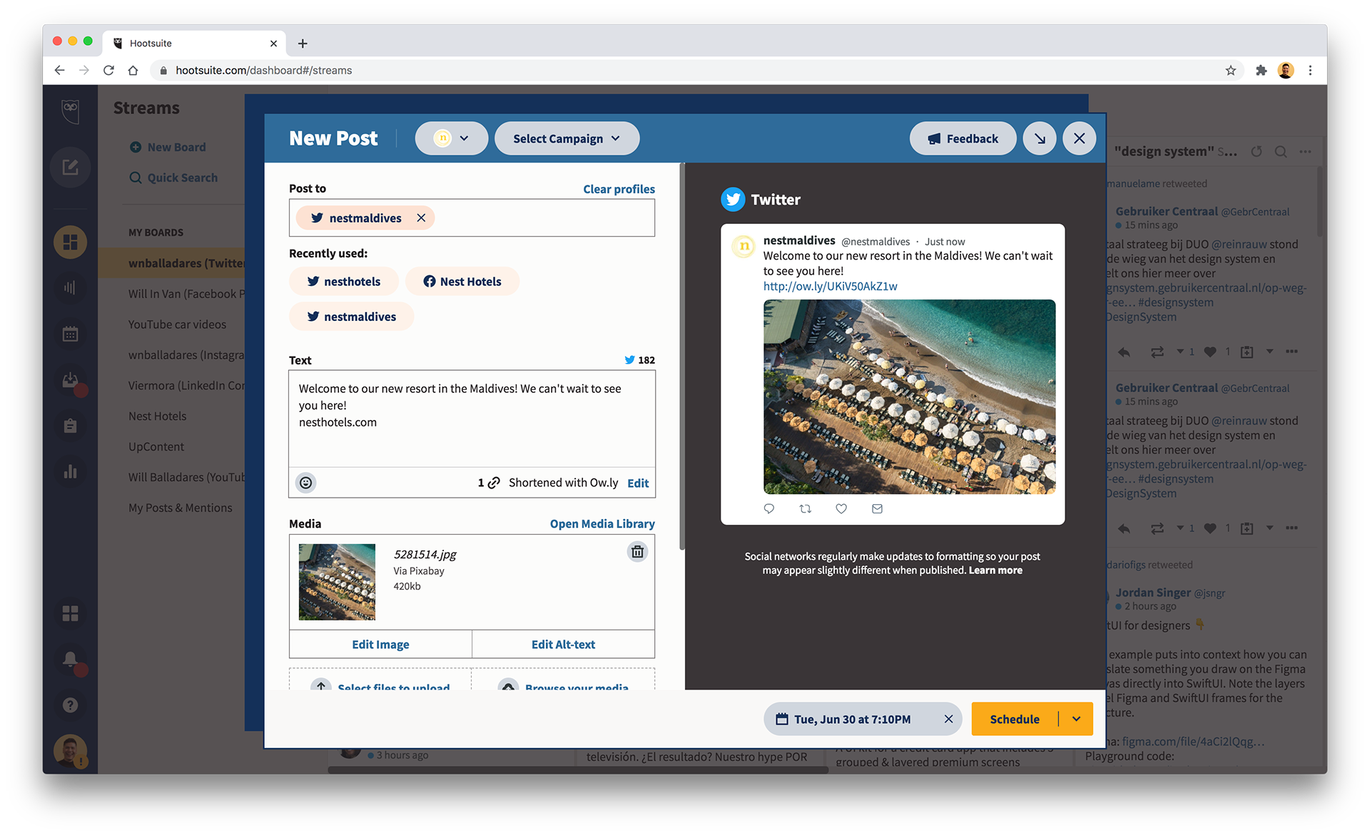
Concept of composer
Concept of planner
3 approaches, 1 caveat
The higher the number of changes, the higher the cost 💸
The higher the number of changes, the higher the cost 💸
1. Bold reinterpretation. The strongest approach, it makes use of all of the potential of the new rebrand.
2. Familiar change. Allows us to change most visual aspects of the app with less cost and risk.
3. Continuity. It affords very little change, little risk, little friction, little innovation.
2. Familiar change. Allows us to change most visual aspects of the app with less cost and risk.
3. Continuity. It affords very little change, little risk, little friction, little innovation.
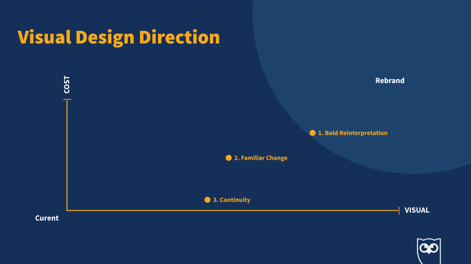
1. Bold reinterpretation
2. Familiar change
3. Continuity
Agreed on a direction
A creative decision with input from design leadership is agree: to pursue the boldest version under a warm colour scheme. I iterated and refined, then quickly prototyped and tested the designs with our social media team. They are a small but mighty team that use our product as their everyday tool, and they gave me good 'user' insight.
The principles:
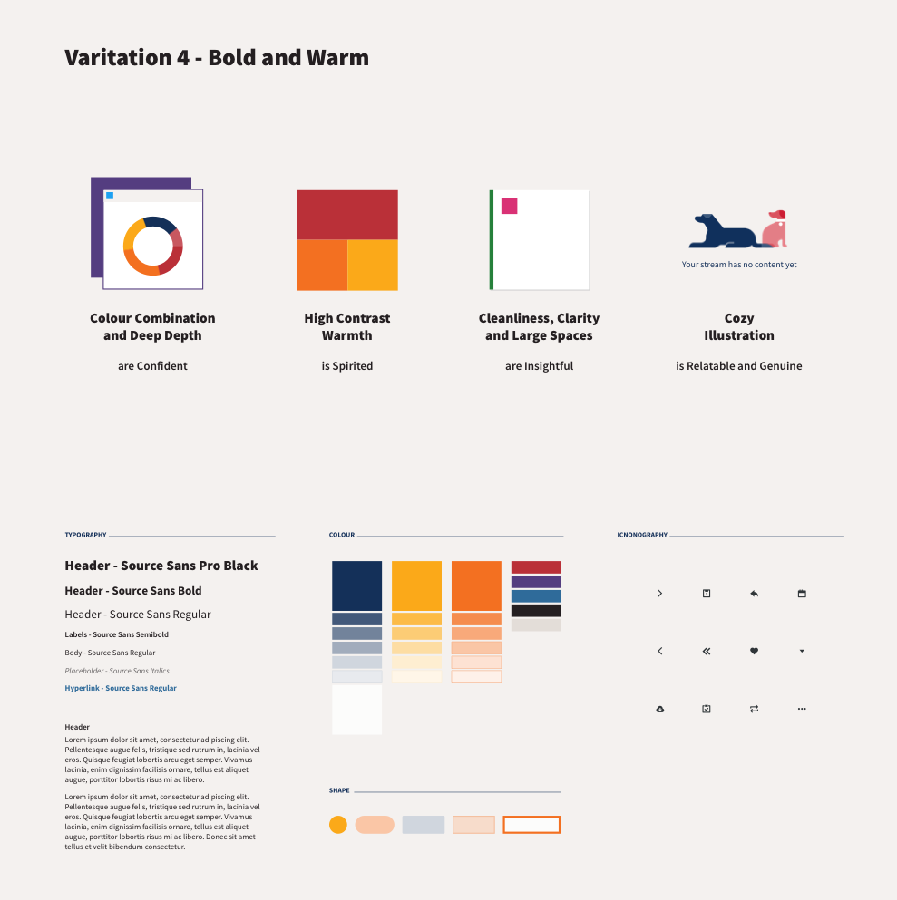
● Colour combination and deep depth are confident
● High contrast warmth is spirited
● Cleanliness, large spaces and clarity are insightful
● Cozy illustrations are relatable and genuine
A design language the scales
Let's conceptualize the approach in product screens
Let's conceptualize the approach in product screens
Concept of Streams
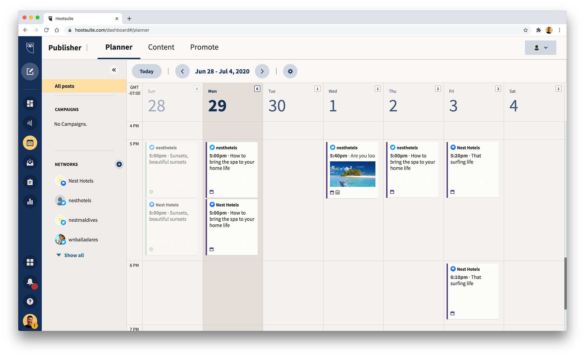
Concept of planner
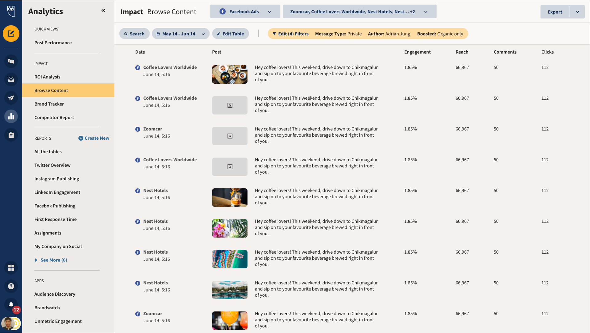
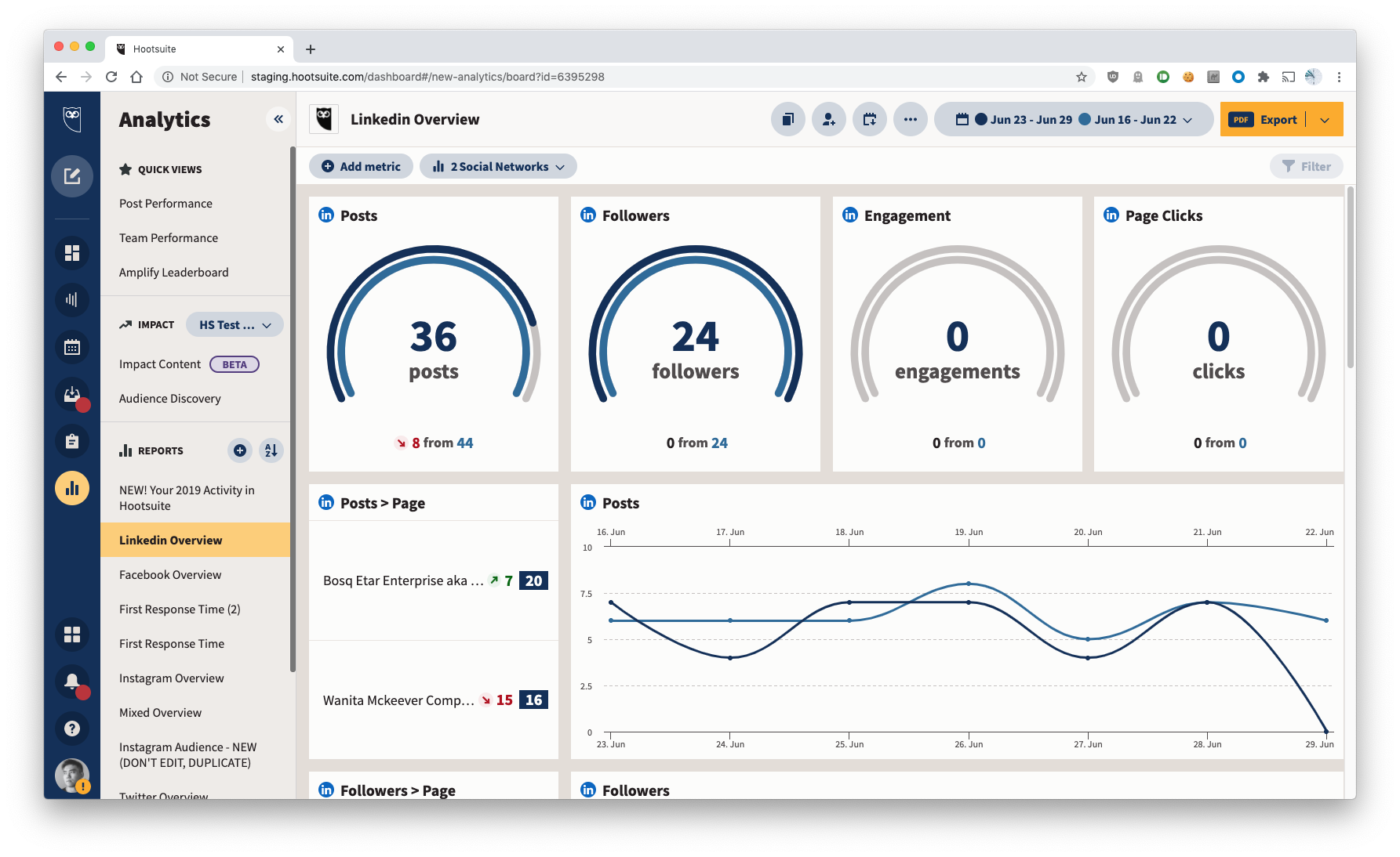
Concept of Analytics
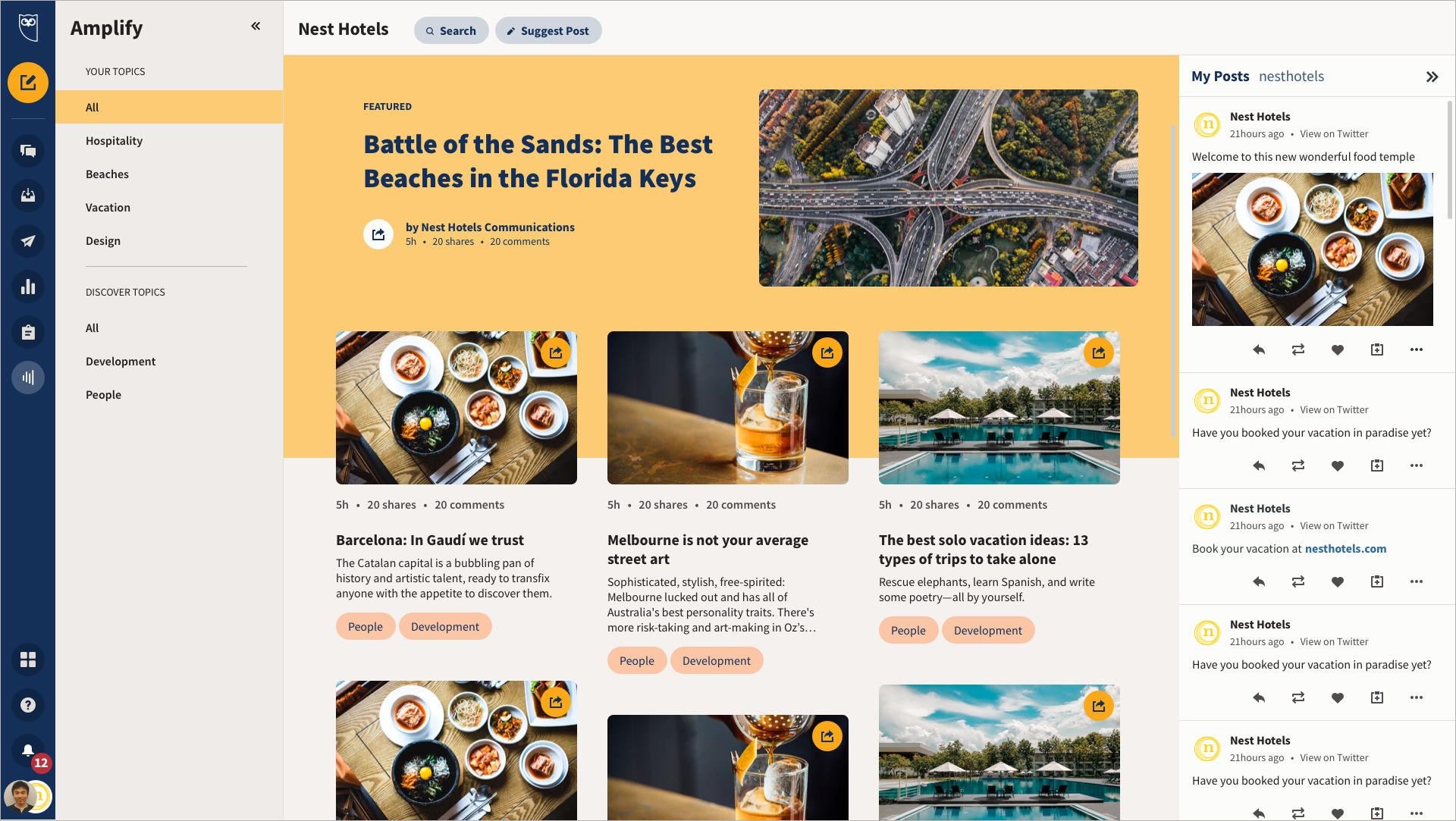
Concept of Amplify
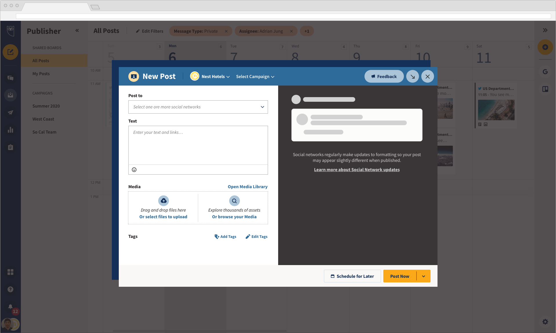
Concept of Composer
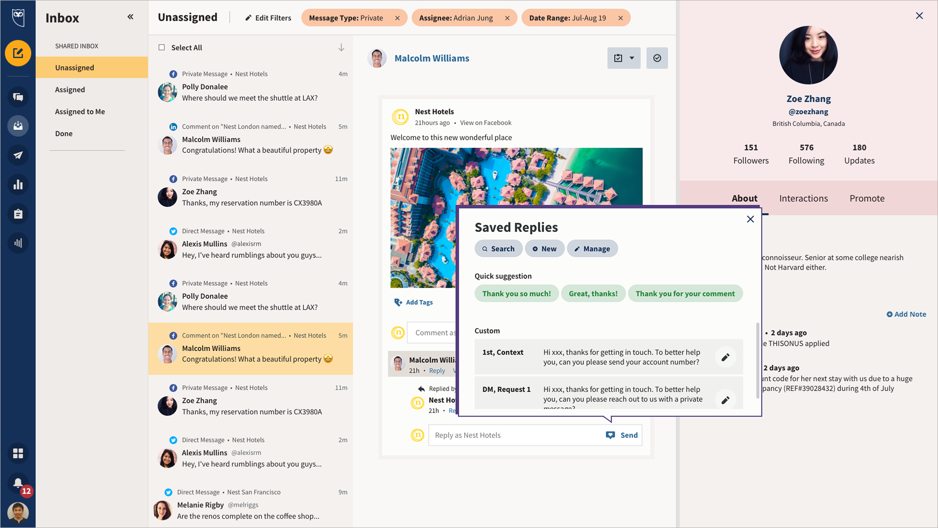
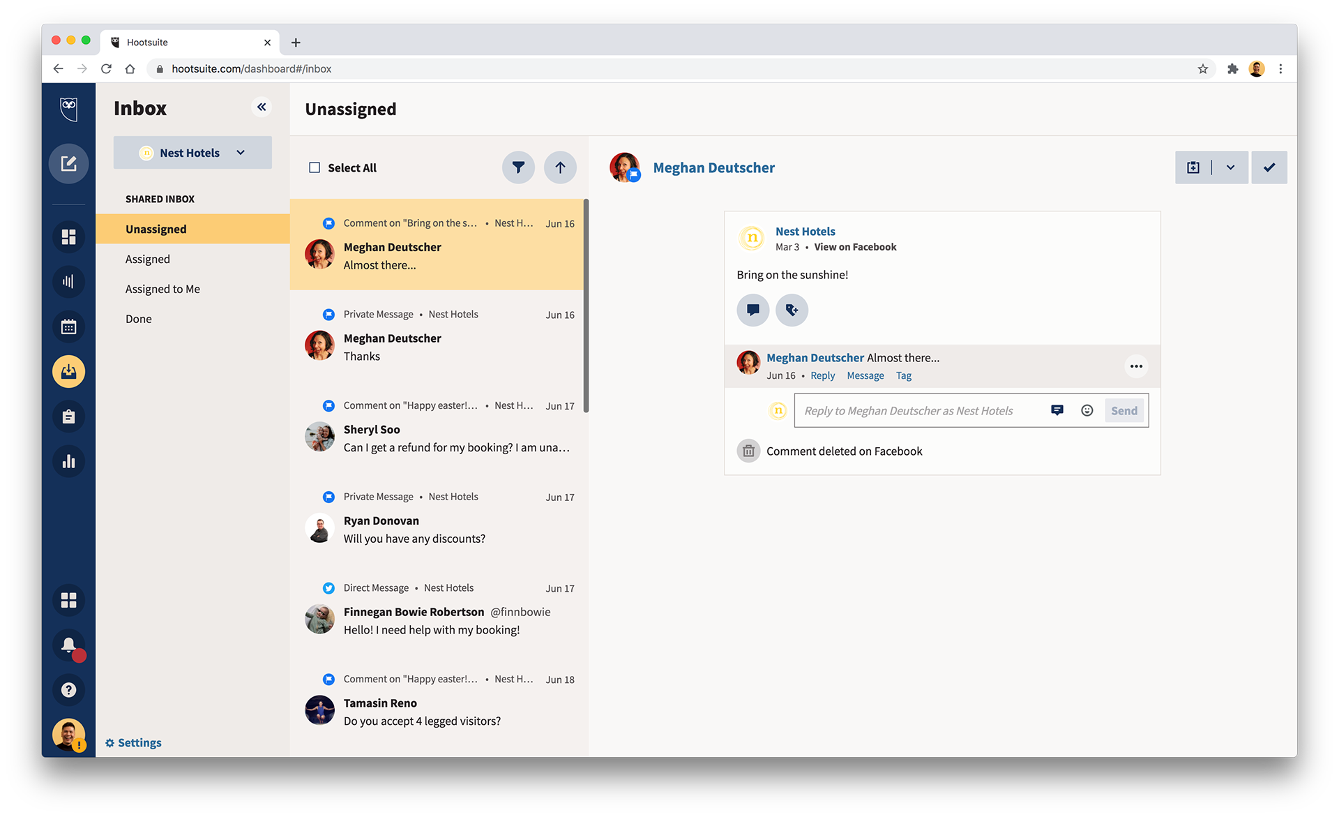
Concept of Inbox
User Research: Benchmark studies
The focus of the study was the functionality of the global nav and its impact on our users most common tasks. However, the UI was mentioned in pre and post questionnaires, as well as during the study to get a sense of first impressions.
The majority of the feedback was positive.
Study Goals:
➜ Validate the navigation of the UI Refresh, to ensure that it does not negatively impact any navigation/usability metrics compared to existing navigation.
➜ Don’t break anything!
Testing
I teamed up with our usability specialist to run our final designs through a benchmark study. We used usertesting.com and tested the current status of the product against the new design (Benchmark 1).
We built prototypes for both current state (control) and the new design in Figma to remove as much bias as possible.
• 14 participants for each study, for a total of 42.
• 7 participants were Hootsuite users, and 7 were not.
• 7 participants were Hootsuite users, and 7 were not.
"Very easy to use. Even [using] a prototype, I prefer it to how it is right now. The GUI is really nice and easy to understand. The flow of everything was in point. The colors used were good as well. I was really never confused or got stumped. On point."
Existing user on Benchmark 2
"It's displaying the accounts individually in an organized fashion with a cool layout".
Non user on Benchmark 2
Execution.
How did we build this?
How did we build this?
Collaborating with multiple teams was the key to a successful high quality delivery on budget and on time.
1. Global office
We worked with all product teams, including our offices in Vancouver HQ, Milan and Bucharest.
Making myself available to any team through Slack and direct communications.
We worked with all product teams, including our offices in Vancouver HQ, Milan and Bucharest.
Making myself available to any team through Slack and direct communications.
2. Agile communication
Setting frequent and constant communication with portfolio development managers and leads to clarify scope, organize priorities, and resolve any issues, blockers or risks.
Setting frequent and constant communication with portfolio development managers and leads to clarify scope, organize priorities, and resolve any issues, blockers or risks.
Being available and open to quickly pivot in case implementation is stalled.
3. Cross organization
The pace of the project by nature was really fast, which required up to date documentation and constant communication. My PM was able to organize a regular cadence that allowed me to ensure all parties involved had all the assets they needed.
The pace of the project by nature was really fast, which required up to date documentation and constant communication. My PM was able to organize a regular cadence that allowed me to ensure all parties involved had all the assets they needed.
4. Design collaboration
Developing mock ups, guidelines and templates for all portfolio areas; and completing style guides and documentation for portfolios that needed it.
Setting foundation for other designers to continue building screens for their own portfolios.
Working with User Education writers to ensure improvements on internationalization and proper translations for supported languages.
Working with my PM and Product Design to ensure smooth design QA and fix bugs and defects.
Analyzing current screen usage to advocate for a future responsive solution that can accommodate up to 95% of our user base comfortably.
Working with Growth and Retention to understand the impact to the A-ha moment and conversion funnels.
Working with Data Analytics to make sure we were able to track all the critical workflows already in product without breaking any of the existing tracking.
Limited release
How did we do?
How did we do?
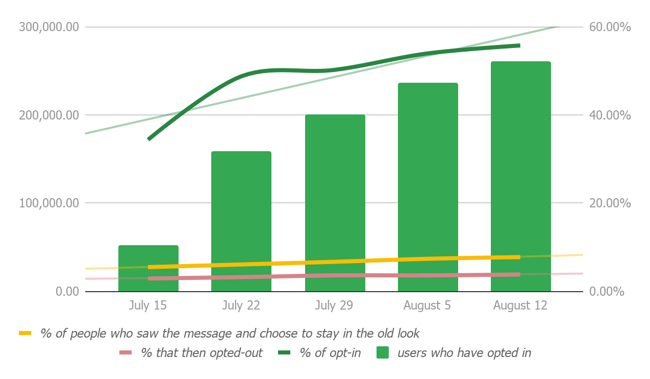
30 day opt-in period
Our release was an opt-in experience approach - we offered a 30 day timeframe in which users could opt-in to try the new look, giving people the choice to decide.
After that period, we would force migrate all users to avoid overhead and risks in maintaining 2 pipelines.
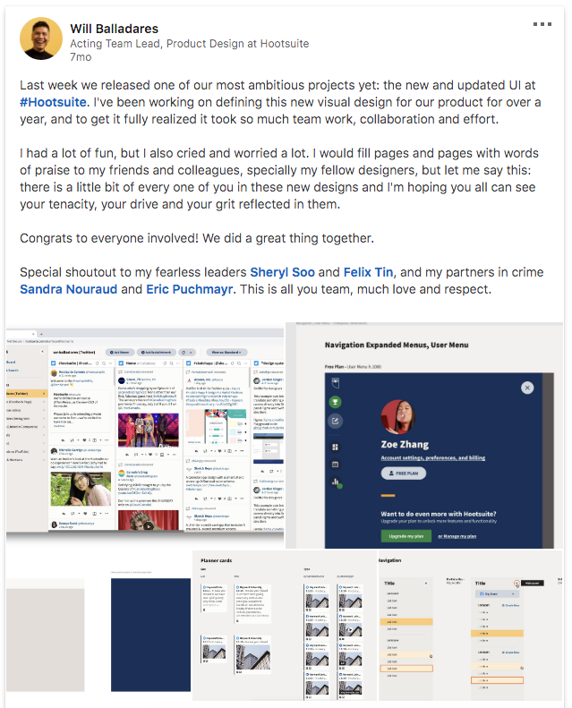
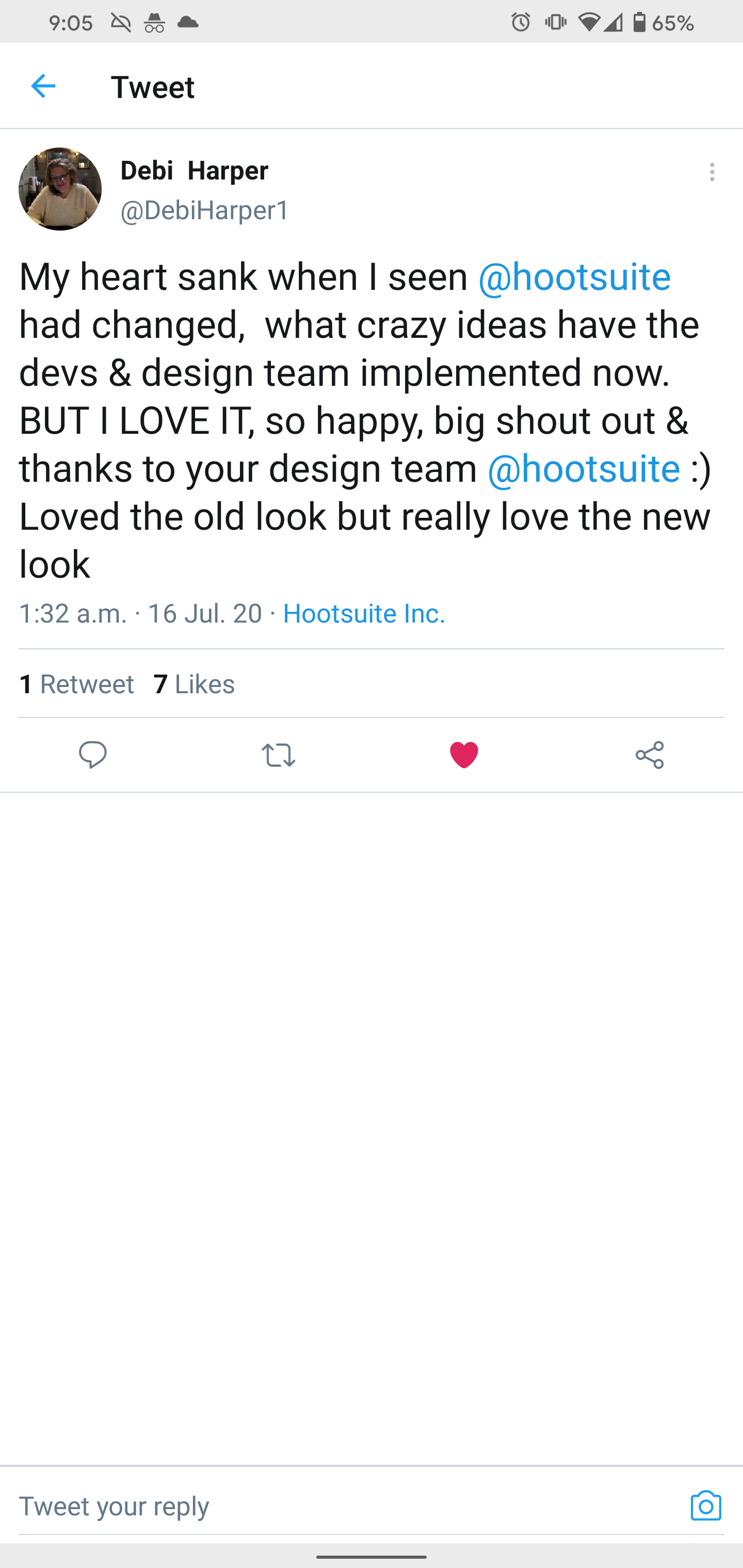
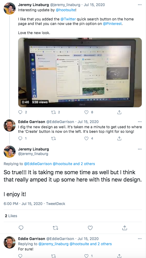
The initial feedback was very positive and we received kind comments on several feedback channels. Including social media and NPS.
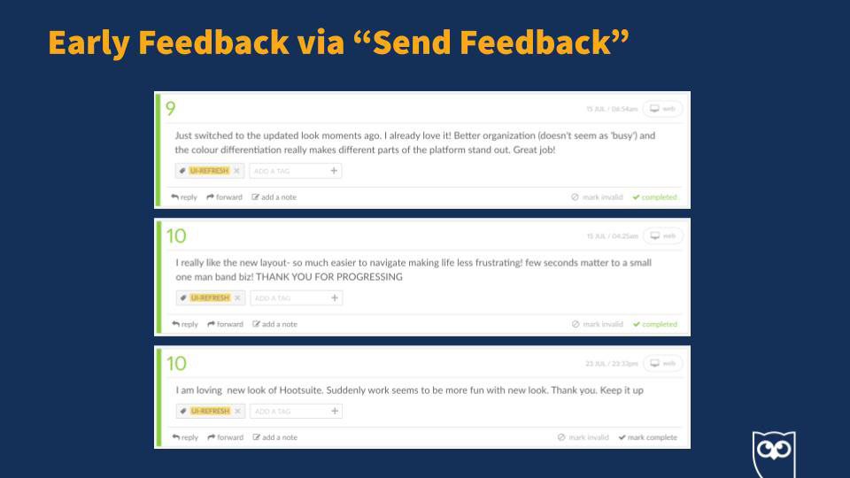
Identify and fix critical bugs
We also responded quickly by fixing any critical defects identified by our users in real time.
Working with my PM Sandra to communicate to our customers the fixes right on social.
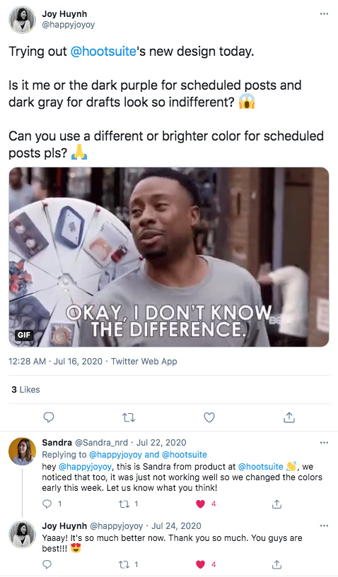
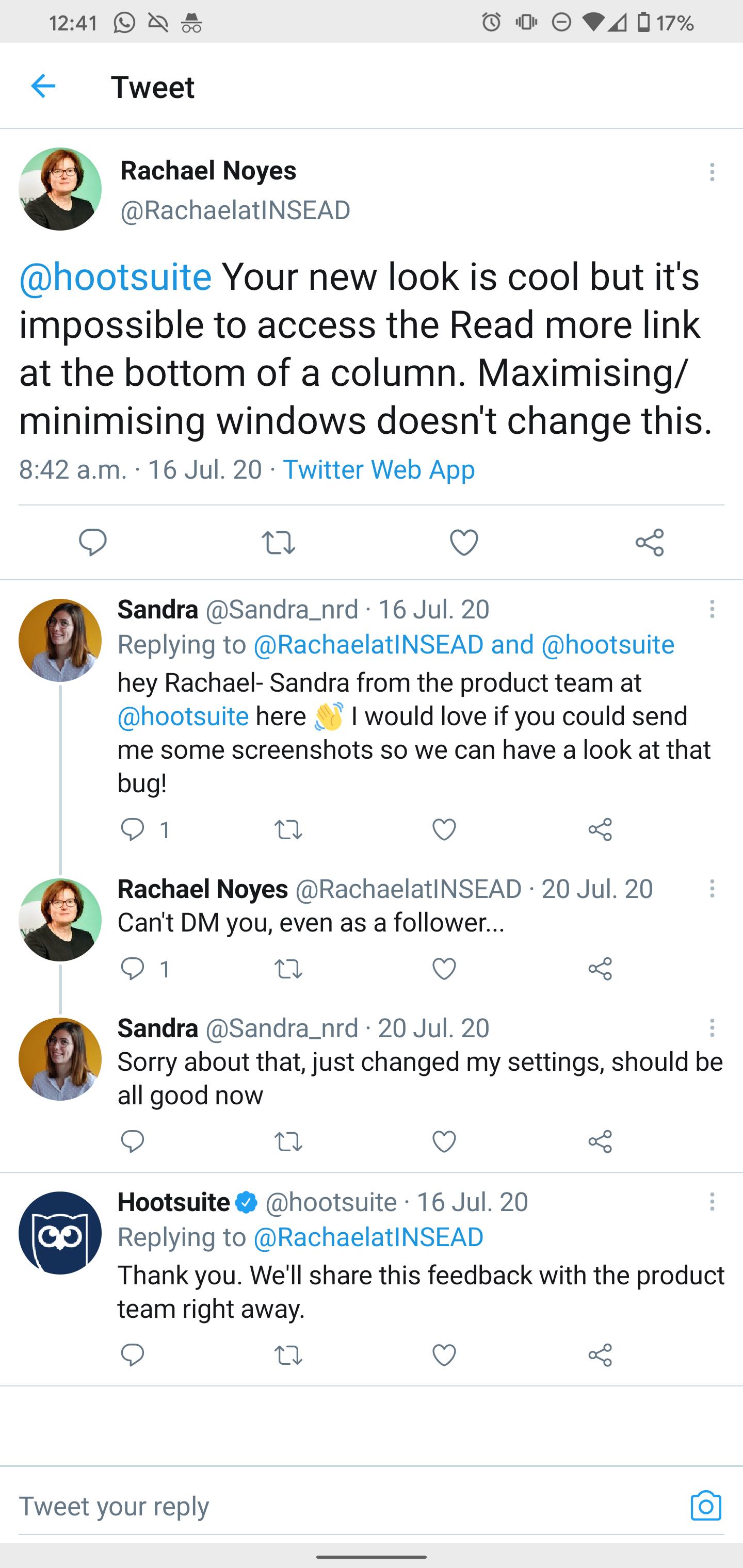
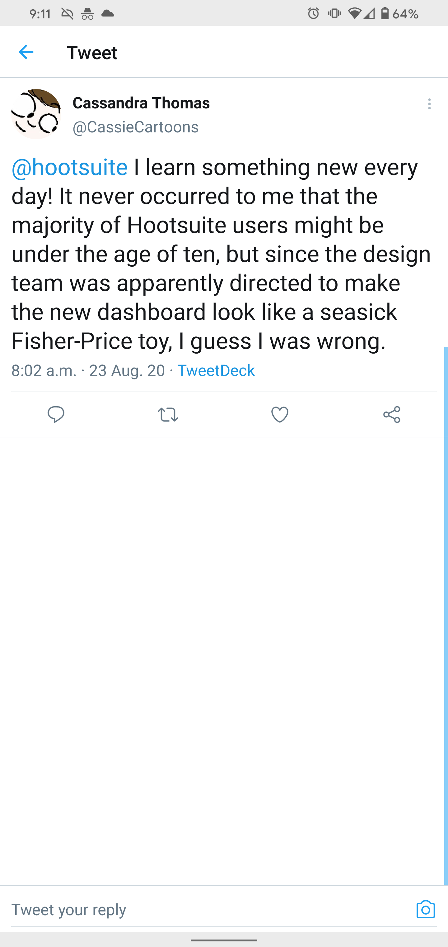
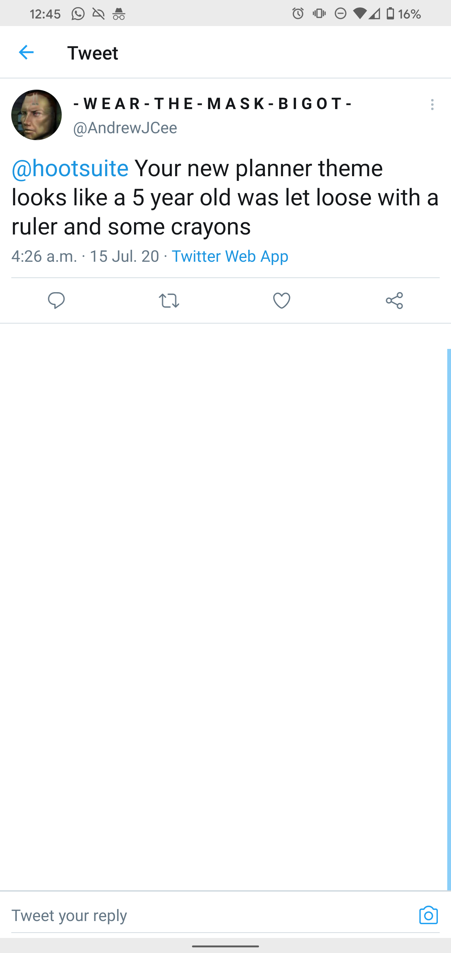
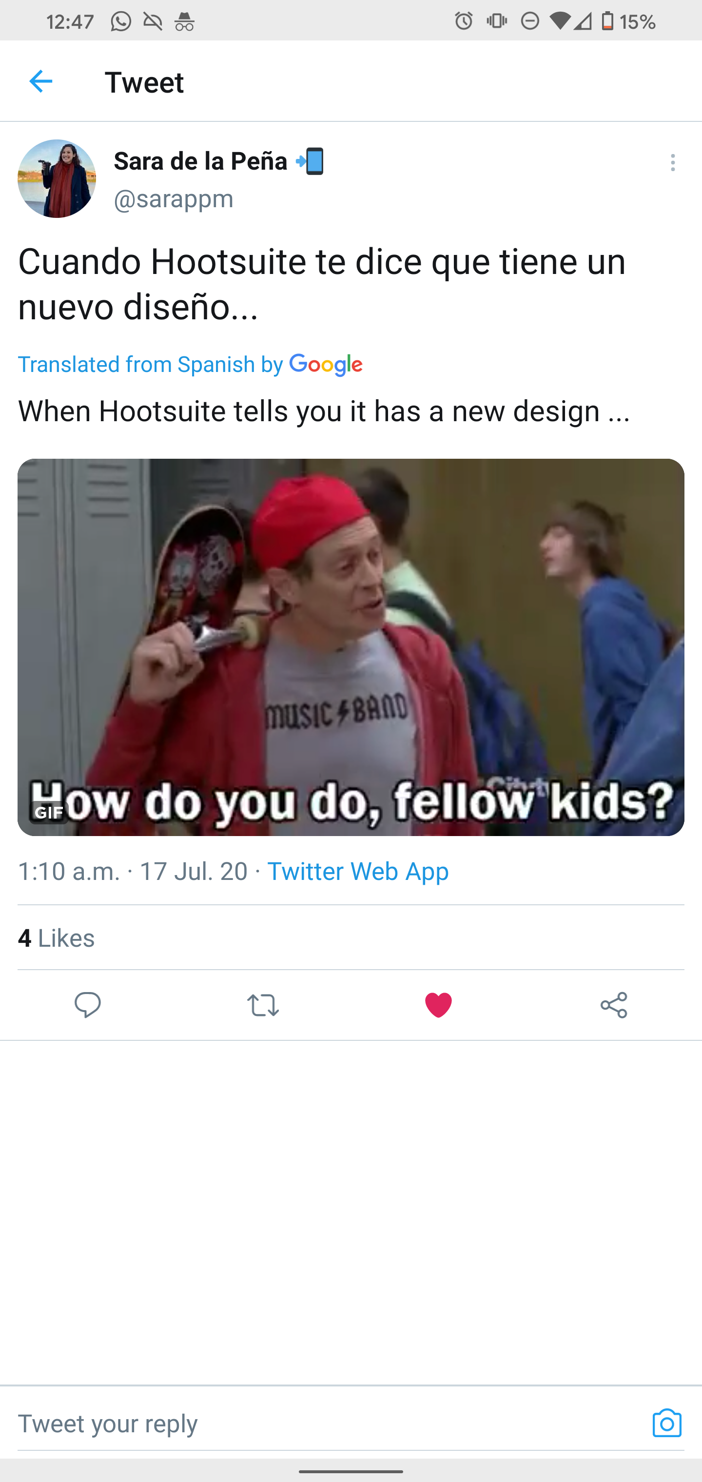
Some people were not happy
We also received not so kind comments, but this is expected with such a big change.
Some of my favourites... 🙈
Measuring success
Forced migration
Forced migration
Baseline
Adoption. “A decent baseline of our users have adopted the new UI at time of the forced migration & users opting-in do not go back to the old UI.”
Quality. “There is no major increase in support tickets in regards to bugs created by the UI refresh at the time of forced migration.”
Product usage. “The UI refresh is not impacting negatively product usage metrics.”
Findings
On August 12th, 55% of the users who logged in during the 4 week period have decided to make the switch to the new UI.
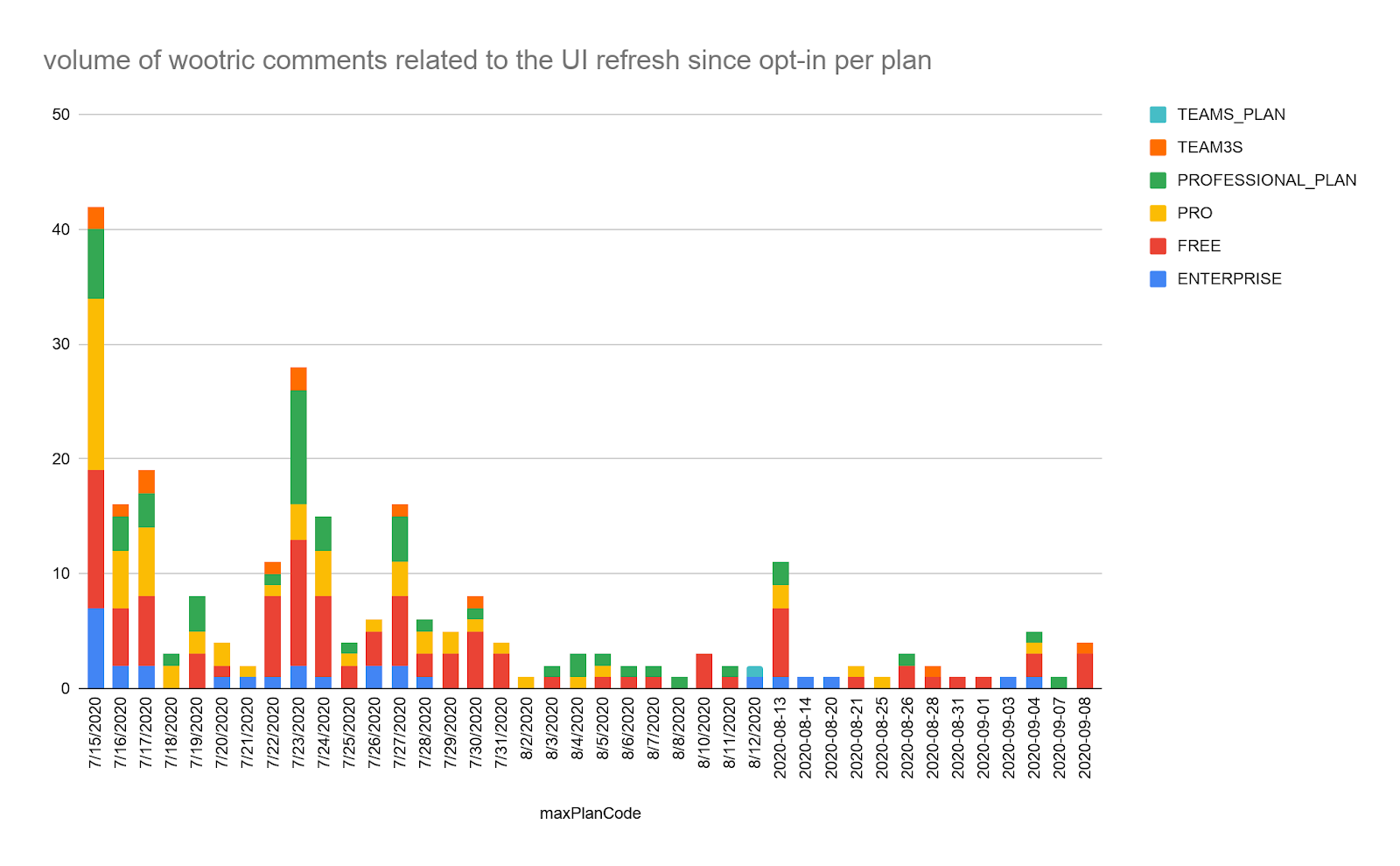
We saw an increase of support ticket volume on the date of forced migration as well as in the following days where some bugs were fixed. Volume is now decreasing.
After 3 weeks, there is no evidence that the new UI has had a negative impact on Habit and Aha rates (and therefore will very likely not decrease conversion and retention).
Volume of comments tagged UX/UI in NPS is stable and decreasing
For self-serve customers in Q4 2020, UX/UI is no longer a top trend across multiple channels, with a direct link to UI refresh.